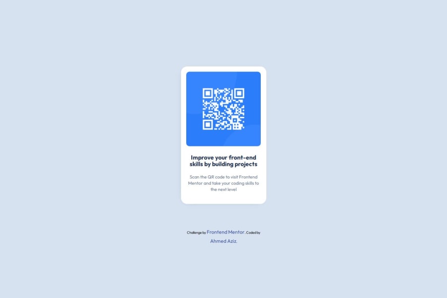
Design comparison
Solution retrospective
I'm very happy with the time I completed the challenge in.
What challenges did you encounter, and how did you overcome them?The QR image was a bit annoying to make responsive, and the container's width property, which I set to fit-content, didn’t work. But I managed to handle the problem—maybe I missed something obvious.
What specific areas of your project would you like help with?image responsive
Community feedback
- P@MikDra1Posted 7 months ago
If you want to make your card responsive with ease you can use this technique:
.card {
width: 90%;
max-width: 37.5rem;
}
On the smaller screens card will be 90% of the parent (here body), but as soon as the card will be 37.5rem (600px) it will lock with this size.
Also to put the card in the center I advise you to use this code snippet:
.container {
display: grid;
place-items: center;
}
Hope you found this comment helpful 💗💗💗
Good job and keep going 😁😊😉
Marked as helpful0 - P@huyphan2210Posted 7 months ago
Hi, @Abo3bazez I saw your solution and I have some thoughts:
- I assume the "container" you're referring to is
.qr-container. You're currently using@media screen and (min-width: 375px)to set itswidthto17.1875rem, which is a fixed size. If you want the image to be fully responsive (as you're usingmax-width: 100%on the image inside the.qr-container), the container itself needs to be responsive too. Consider setting the.qr-containerwidth to a relative value, like90%, and then apply amax-widthwith a reasonable absolute value. For example:
.qr-container {
    width: 90%;
    max-width: 400px;
}
Let me know if that works!
Marked as helpful0 - I assume the "container" you're referring to is
Please log in to post a comment
Log in with GitHubJoin our Discord community
Join thousands of Frontend Mentor community members taking the challenges, sharing resources, helping each other, and chatting about all things front-end!
Join our Discord
