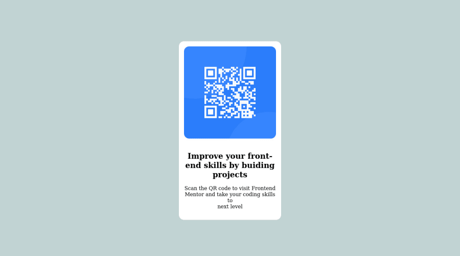
Design comparison
Solution retrospective
I couldn't align the card vertically despite the "align-items: center;" so I used the margin-top ...
Community feedback
- @Swing95Posted over 2 years ago
Hello,
Try to stay away of using heights as you can cause responsivity issues with that, try paddings instead. That will cause to adjust your wrapper (main) adjust height based on needs of other elements.
Use main to wrap content
Use code bellow to avoid box size issues and margin and padding calculations
- { padding: 0; margin: 0; box-sizing: border-box; }
Make a div that will contain only QR code and fill it with image. Then set image to have 100% height and width and display as block.
Good luck!
Marked as helpful1 - @MelvinAguilarPosted over 2 years ago
Hello there 👋. Good job on completing the challenge !
I have some suggestions about your code that might interest you.
- To center an element vertically, you should use a height to its container. In this case it is recommended to use "min-height: 100vh" so that it occupies 100% of the viewport height. e.g.:
section {
    display: flex;
    justify-content: center;
    align-items: center;
    min-height: 100vh;
    /* margin-top: 13rem; */
}
HTML 📄:
- Use the
<main>tag to wrap all the main content of the page instead of the<section>tag. With this semantic element you can improve the accessibility of your page.
- Use the
<footer>tag to wrap the footer of the page instead of the<div class="attribution">. The<footer>element contains information about the author of the page, the copyright, and other legal information.
- The
<br>tag is not a semantic element. If a screen reader user is reading the page, they will hear "line break", which breaks the flow of the content. Instead, use CSS properties likemargin,paddingormax-widthto add vertical space between elements.
- Since this component involves scanning the QR code, the image is not a decoration, so it must have an
altattribute. Thealtattribute should explain its purpose. e.g.QR code to frontendmentor.io
CSS 🎨:
- Use
max-width: 20remto.QrCardselector instead of width, this will make the container card a bit responsive on mobile and set the element's maximum width to 20rem.
-
Setting a defined
heightfor the card component is not recommended. The content should define the component height, otherwise, it will not be allowed to extend beyond your specifications. Alternatively, you can usemin-height..QrCard { /* display: flex; */ /* flex-direction: column; */ /* align-items: center; */ /* justify-content: center; */ text-align: center; /* height: 31rem; */ /* width: 20rem; */ max-width: 20rem; border-radius: 16px; background-color: #fff; }
- You should use a CSS reset to remove the default browser styles and make your page look the same in all browsers.
I hope you find it useful! 😄 Above all, the solution you submitted is great!
Happy coding!
Marked as helpful0
Please log in to post a comment
Log in with GitHubJoin our Discord community
Join thousands of Frontend Mentor community members taking the challenges, sharing resources, helping each other, and chatting about all things front-end!
Join our Discord
