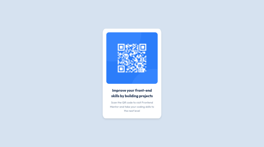
Design comparison
Solution retrospective
First project on FEM. Have created this component using explicit width. Is this the way to go? Or should the content dictate the width? And working towards making in responsive in the future.
Community feedback
- @0xabdulkhaliqPosted over 1 year ago
Hello there 👋. Congratulations on successfully completing the challenge! 🎉
- I have other recommendations regarding your code that I believe will be of great interest to you.
HTML 🏷️:
- This solution generates accessibility error reports due to incorrect usage of
semantic
markup, which confuses landmark for a webpage
- So fix it by replacing the
<section>
with semantic element<main>
in yourindex.html
file to improve accessibility and organization of your page.
- What is meant by landmark ?, They used to define major sections of your page instead of relying on generic elements like
<div>
or<span>
- They convey the structure of your page. For example, the
<main>
element should include all content directly related to the page's main idea, so there should only be one per page
HEADINGS ⚠️:
- And, this solution had generated accessibility error report due to lack of level-one heading
<h1>
- Every site must want at least one
h1
element identifying and describing the main content of the page.
- An
h1
heading provides an important navigation point for users of assistive technologies, allowing them to easily find the main content of the page.
- So we want to add a level-one heading to improve accessibility by reading aloud the heading by screen readers, you can achieve this by adding a
sr-only
class to hide it from visual users (it will be useful for visually impaired users)
I hope you find this helpful 😄 Above all, the solution you submitted is great !
Happy coding!
Marked as helpful0 - @ohuttarPosted over 1 year ago
Hello,
In regards to setting a width, I think there's no problem with it for this particular challenge. However, as the complexity of challenges increases and you need your solutions to be responsive on different devices, I find that allowing containers to grow/shrink with their content and using max-width/min-width is the way to go.
Hope this helps!
0
Please log in to post a comment
Log in with GitHubJoin our Discord community
Join thousands of Frontend Mentor community members taking the challenges, sharing resources, helping each other, and chatting about all things front-end!
Join our Discord