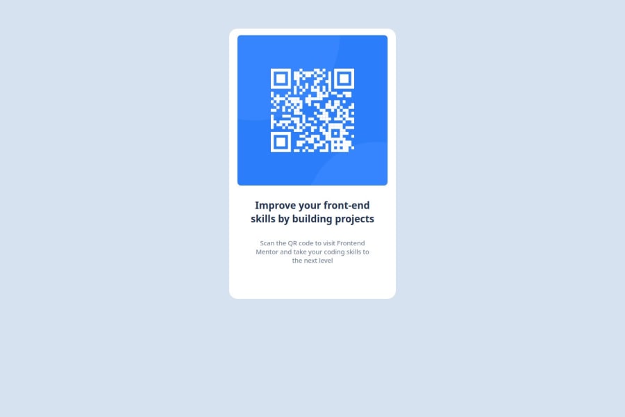
Design comparison
Solution retrospective
I am especially proud of the flexbox because at start i had some difficulty but now i can say that i master it better for next time i should use css grid to solve the challenge
What challenges did you encounter, and how did you overcome them?The main challenge that i encounter was the responsive design and sometimes the flexbox
What specific areas of your project would you like help with?Like any human work, mine is not perfect, so i call you to share with me all your comments and suggestions concerning my work, in particular the responsive design.
Community feedback
- @kamilk0192Posted about 2 months ago
You shouldn't split text into two h1's if u want it to be in two lines instead of it use <br>. The box isn't centered vertically because instead of centering it u just moved it 65 px from top. You should center it using flex and applying justify-content: center; and align-items: center; You probably encountered same problem as me that align-items didnt center it vertically and it's because the body doesnt take actually 100% of site height. I got around that by making main box inside <section> that i scaled height: 100%; I like splitting the box into 3 parts. If u want u can look at my code, i think it's pretty simple and you can see how I did it differently https://kamilk0192.github.io/qr-website-fe-mentor/site.html | https://github.com/kamilk0192/qr-website-fe-mentor.
Marked as helpful0@AllcodInPosted about 2 months agoThank you very much for your comment @kamilk0192 I find elements there which will allow me to optimize my code and I want to tell you that I appreciate your code it is clean and understandable
0
Please log in to post a comment
Log in with GitHubJoin our Discord community
Join thousands of Frontend Mentor community members taking the challenges, sharing resources, helping each other, and chatting about all things front-end!
Join our Discord
