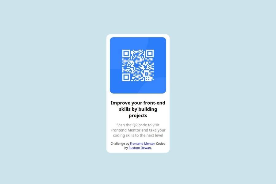
Design comparison
SolutionDesign
Solution retrospective
What are you most proud of, and what would you do differently next time?
Complete it in an hour.
What challenges did you encounter, and how did you overcome them?Mostly when it comes to responsive but getting used to it.
What specific areas of your project would you like help with?I would like a feedback on the code if there is a better way for me to use it.
Community feedback
Please log in to post a comment
Log in with GitHubJoin our Discord community
Join thousands of Frontend Mentor community members taking the challenges, sharing resources, helping each other, and chatting about all things front-end!
Join our Discord
