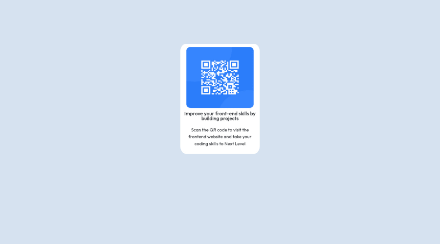
Design comparison
Solution retrospective
how's this? can someone tell me what went wrong here
Community feedback
- @MelvinAguilarPosted almost 2 years ago
Hello there 👋. Good job on completing the challenge !
I have some suggestions about your code that might interest you.
HTML 📄:
- Use the
<main>tag to wrap all the main content of the page instead of the<div>tag. With this semantic element you can improve the accessibility of your page.
Alt text 📷:
-
The
altattribute should explain the purpose of the image. Uppon scanning the QR code, the user will be redirected to the frontendmentor.io website, so a betteraltattribute would beQR code to frontendmentor.ioIf you want to learn more about the
altattribute, you can read this article. 📘.
CSS 🎨:
- To center the component in the page, you should use Flexbox or Grid layout. You can read more about centering in CSS here 📘.
body { background-color: hsl(212, 45%, 89%); text-align: center; min-height: 100vh; display: grid; place-content: center; } .middle-container { width: 260px; height: 360px; /* margin: auto; */ /* margin-top: 10%; */ /* margin-bottom: 10%; */ }- When using media query there is no need to rewrite the same styles, the styles outside of a media query remain.
@media (max-width: 375px)
.middle-container {
    /* width: 260px; */
    /* height: 360px; */
    /* margin: auto; */
    /* margin-top: 50%; */
    /* margin-bottom: 10%; */
    /* background-color: white; */
    /* border-radius: 7%; */
}
I hope you find it useful! 😄
Happy coding!
Marked as helpful1@himanshukumarpandey77Posted almost 2 years ago@MelvinAguilar Appreciated for sharing this sir, as i am beginner i was not able to center the elements properly, thankyou for sharing a review.
Himanshu Pandey
0 - Use the
Please log in to post a comment
Log in with GitHubJoin our Discord community
Join thousands of Frontend Mentor community members taking the challenges, sharing resources, helping each other, and chatting about all things front-end!
Join our Discord
