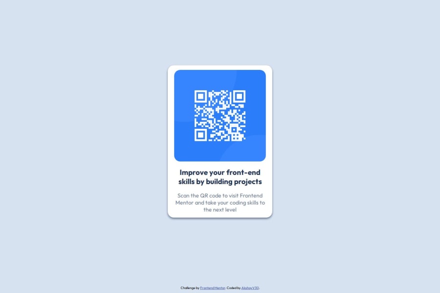
Design comparison
Community feedback
- @jpcardozxPosted 9 months ago
The solution effectively uses semantic HTML elements like <header>, <main>, and <footer>, which enhances structure and accessibility. While the code is generally accessible, improvements could include adding descriptive alt attributes for images and ensuring all interactive elements are keyboard accessible. ARIA landmarks and roles could further improve navigation for screen readers.
The layout is responsive and maintains visual consistency across different screen sizes, thanks to CSS Flexbox. The code is well-structured and readable, but adopting a modular CSS approach or using a preprocessor could enhance reusability. Overall, the implementation aligns well with the design specifications, with no significant deviations. Further testing and refinements may be necessary to perfect the design and functionality.
0
Please log in to post a comment
Log in with GitHubJoin our Discord community
Join thousands of Frontend Mentor community members taking the challenges, sharing resources, helping each other, and chatting about all things front-end!
Join our Discord
