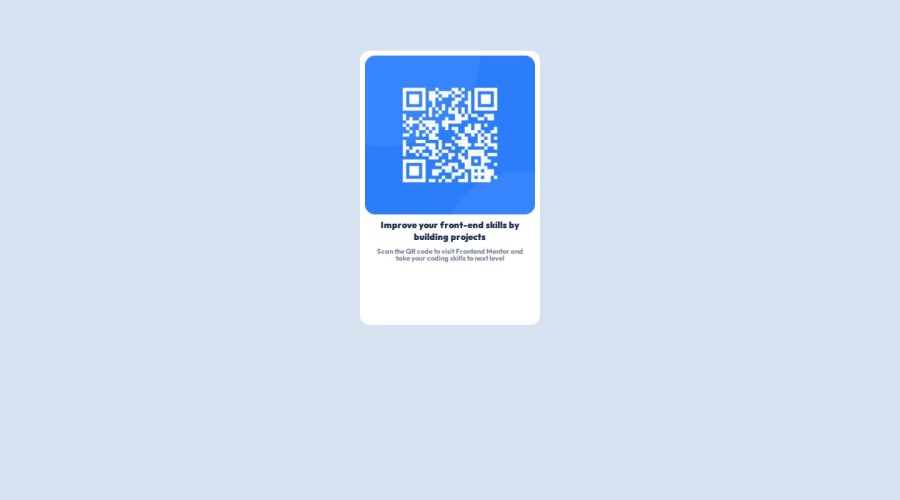
Design comparison
SolutionDesign
Solution retrospective
What are you most proud of, and what would you do differently next time?
While watching tutorial i thought css is easy but i really struggled in this project
What challenges did you encounter, and how did you overcome them?i was really struggling with units and proper placement of divs and after lots of trial and error i overcame it
What specific areas of your project would you like help with?I am just starting out i would greatly appreciate tips regarding which are the most useful css units and how to make a page responsive
Community feedback
Please log in to post a comment
Log in with GitHubJoin our Discord community
Join thousands of Frontend Mentor community members taking the challenges, sharing resources, helping each other, and chatting about all things front-end!
Join our Discord
