Design comparison
Solution retrospective
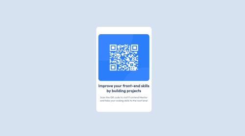
This is my first project that I made in my Frontend Developer journey. It was quite useful because it helped me to get used to HTML and CSS. It motivated me to keep trying to develop other projects.
Community feedback
- @correlucasPosted over 2 years ago
Hello Dalia, how are you? Welcome to Frontend Mentor and congratulations for you first solution!
Here is some tips:
-
You dont need to set the card height, the height of the card will come from the padding/margins you'll give to the elements, is for this reason that the QR Code has a bigger margin on top in comparison to the sides.
-
For the box, you can set max-width instead of width, this way you card will stretch when get smaller than 325px, if you set only width the card width will be ever a fixed value and not behave responsive:
.box { max-width: 325px; max-height: 500px; }
- Consider that the QR Code is a square so you can set this with max-width or 100% if you want that the image grows 100% of the container:
#qr-code { max-width: 300px; max- height: 300px; border-radius: 1em; }
- The box shadow value is
box-shadow: 5px 5px 15px 5px rgb(0 0 0 / 3%);
and you can apply it to the container.
You take a look on my solution, to understand better what I've said about the card construction, maybe I didn't explain it clearly and seeing the code you get it.
https://www.frontendmentor.io/solutions/qr-code-component-SJkAUS-Iq
I hope it helps you! Keek it up.
Marked as helpful0 -
- @Gaurab019Posted over 2 years ago
Great Job....... I dont see any box shadow on the card......which i think was part of the design. I dont see media query either so need to check on the responsiveness
Marked as helpful0
Please log in to post a comment
Log in with GitHubJoin our Discord community
Join thousands of Frontend Mentor community members taking the challenges, sharing resources, helping each other, and chatting about all things front-end!
Join our Discord