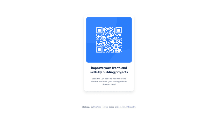
Design comparison
Solution retrospective
Hey everyone, I'm complety new in web development after taken some lessons in HTML/CSS, I decided to train with challenge. So I did this QR Code challenge. I almost done everything but I thought my background is not enough dark compared of image preview but I don't know why. May be because of my web browser
Let me know some feedback and advice to perform my code.
Thanks a lot
Community feedback
- @correlucasPosted over 2 years ago
👾Hi Alexandre, congratulations for your first solution!👋 Welcome to the Frontend Mentor Coding Community!
Great solution and great start! By what I saw you’re on the right track. I’ve few suggestions to you that you can consider to add to your code:
1.When you download the project files there’s a file called
style-guide.mdwhere you can find information such ashsl color codesand thefont-sizefor the headings. The background-color in this case isbackground-color: #D5E1EF2.Use
<main>instead of<div>to wrap the card container. This way you show that this is the main block of content and also replace the div with a semantic tag.3.Use units as
remoreminstead ofpxto improve your performance by resizing fonts between different screens and devices. These units are better to make your website more accessible. REM does not just apply to font size, but to all sizes as well.4.Something I've noticed in your code is that in many occasions you've added some
<div>to wrap contents that don't really need to be inside of a div block. Note that for this challenge all you need is a single block to hold all the content, can be<div>or<main>if you want to use a semantic tag to wrap the content, the cleanest structure for this challenge is made by a block of content with div/main and all the content inside of it (img, h1 and p) without need of any other div or something. See the structure below:<body> <main> <img src="./images/image-qr-code.png" alt="Qr Code Image" > <h1>Improve your front-end skills by building projects</h1> <p>Scan the QR code to visit Frontend Mentor and take your coding skills to the next level</p> </main> </body>✌️ I hope this helps you and happy coding!
Marked as helpful0@AlexskqPosted over 2 years ago@correlucas Thanks for your feedback.
I made some changes as you advice me. Could you please check it if it's correct ? (I published it on a new git branch : https://github.com/Alexskq/QR-Code-component/tree/neworder )
Thanks.
0 - @denieldenPosted over 2 years ago
Hi Alexandre, congratulations on completing the challenge, great job! 😁
Some little tips for optimizing your code:
- add
background-colorto body - add
maintag and wrap the card for improve the Accessibility - also you can use
articletag instead of a simpledivto the container card for improve the Accessibility - remove all
marginfrom.qrcodeclass because with flex they are superfluous - use property of flexbox to center the card. Read here -> best flex guide
- use
min-height: 100vhinstead ofheight, otherwise the content is cut off when the browser height is less than the content - instead of using
pxuse relative units of measurement likerem-> read here
Hope this help! Happy coding 😉
Marked as helpful0@AlexskqPosted over 2 years ago@denielden
Thanks for your feedback :)
I've made some optimization. Can you please check if it is correct ?
https://github.com/Alexskq/QR-Code-component
Thanks.
0 - add
Please log in to post a comment
Log in with GitHubJoin our Discord community
Join thousands of Frontend Mentor community members taking the challenges, sharing resources, helping each other, and chatting about all things front-end!
Join our Discord
