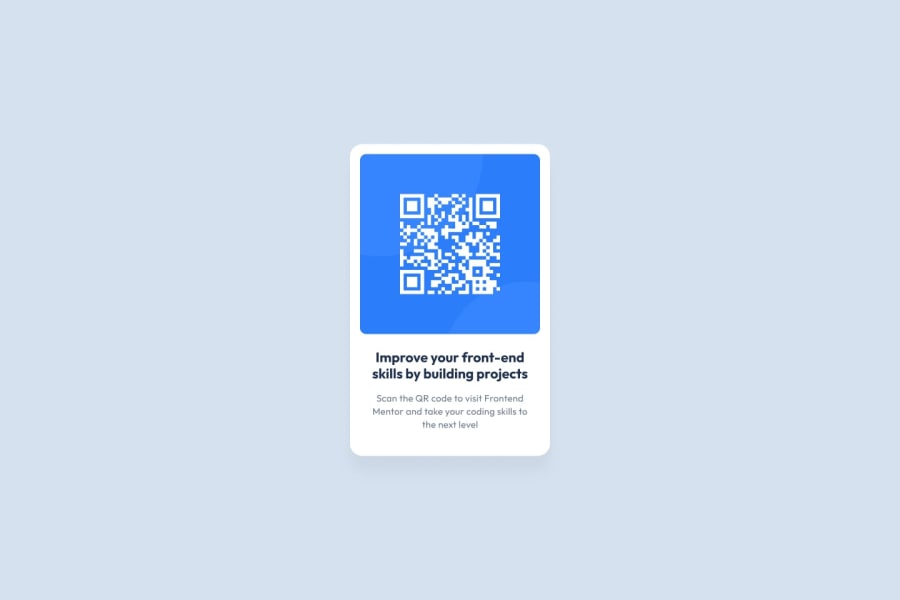
Design comparison
Solution retrospective
Turning the attribution into a box which inverts the color of background and text when hovered over, it might be unnecessary but doing something of my own idea feels good.
What challenges did you encounter, and how did you overcome them?Adapting to Git and GitHub's process to add, commit and push was initially challenging but now I'm comfortable with it.
Community feedback
- @Anas-95Posted 4 months ago
Hey Aashay,
I'm not a senior who can give you feedback, but seniors recommend using semantic HTML. I really like your design, especially the two buttons! Well done! And it's fully responsive too!
1@TheAashayPosted 4 months agoAdded <main> tag after accessibility report, now there are no issues in the report, thanks for reminding @Anas-95
1 - @gmdpickettPosted 4 months ago
You've done well with the main challenge of laying out the main div with the qr code image using flexbox.
I would suggest looking at other solutions for the attribution content. While the inclusion of these as buttons shows some additional HTML / CSS skill, the content isn't meant to have this kind of focus on the page, it's more like the copyright in the footer.
Keep up the great work!
1@TheAashayPosted 4 months agoI'll keep it in mind next time, thanks for suggestion @gmdpickett
0 - @Ricardo-BarbosantosPosted 4 months ago
Your site is amazing, wow.
1
Please log in to post a comment
Log in with GitHubJoin our Discord community
Join thousands of Frontend Mentor community members taking the challenges, sharing resources, helping each other, and chatting about all things front-end!
Join our Discord
