Submitted 8 months ago
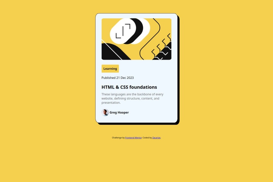
qr-code-component-main Used Html and CSS to complete the challenge.
@zacarias39
Design comparison
SolutionDesign
Solution retrospective
What are you most proud of, and what would you do differently next time?
I'm proud because I manage to complete. I would do it with flexbox instead.
What challenges did you encounter, and how did you overcome them?The one that took my time was to align the name with the profile picture. I set the vertical-align to middle, that kind of solved my issue.
What specific areas of your project would you like help with?I need help making those challenges pretty responsive.
Community feedback
Please log in to post a comment
Log in with GitHubJoin our Discord community
Join thousands of Frontend Mentor community members taking the challenges, sharing resources, helping each other, and chatting about all things front-end!
Join our Discord
