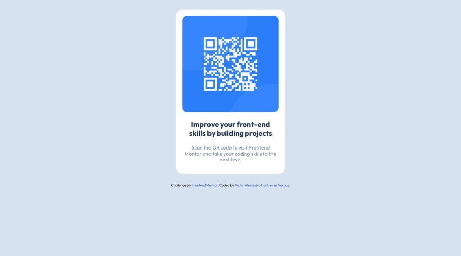
Design comparison
SolutionDesign
Community feedback
- @0xabdulkhaliqPosted over 1 year ago
Hello there 👋. Congratulations on successfully completing the challenge! 🎉
- I have other recommendations regarding your code that I believe will be of great interest to you.
QR iMAGE ALT TEXT 📸:
- Since this component involves scanning the QR code, the image is not a decoration, so it must have an
altattribute.
- The
altattribute should explain the purpose of theimage.
- E.g.
alt="QR code to frontendmentor.io"
<img src="/images/image-qr-code.png" alt="QR code to frontendmentor.io">
.
I hope you find this helpful 😄 Above all, the solution you submitted is great !
Happy coding!
Marked as helpful1@vc743Posted over 1 year ago@0xAbdulKhalid Thank so much for the feedback, I completely forgot about the alt attribute😅, but I will add it.👍
0 - @istealersn-devPosted over 1 year ago
Great effort!! with a small tweak you can center the component by adding height to the following code; specifying the body height allows the css property to align items accordingly
body{
    background-color: hsl(212, 45%, 89%);
    height: 100vh;
    display: flex;
    justify-content: center;
    align-items: center;
    flex-direction: column;
    font-family: 'Outfit', sans-serif;
}
Marked as helpful1
Please log in to post a comment
Log in with GitHubJoin our Discord community
Join thousands of Frontend Mentor community members taking the challenges, sharing resources, helping each other, and chatting about all things front-end!
Join our Discord
