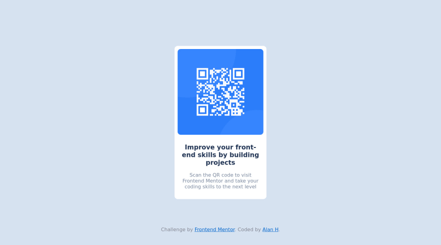
Design comparison
Solution retrospective
I had no issues with this one. Only with the footer section that frontendmentor gives you, maybe because it wasn´t in the design.
Community feedback
- @AtanasovCodePosted almost 2 years ago
I opened your solution on Firefox and I don't know if it is because of the footer, but the footer and the card are mashed together and are at the bottom of the screen instead of the card being in the middle.
If you want to keep the footer (you can delete it freely if you don't want it), may I suggest positioning it absolute so that it does not affect any other elements on the page.
And looking at your solution in Firefox, I can see that you gave the card a fixed width. This is fine because you want the size of the card to stay the same but I would suggest adding a media query when the window reaches a certain size, and make the width of the card take up 90vw (or don't specify a width and just give it some margin). This way it is more responsive and it will take up more of the screen which can increase readability on smaller screens.
Otherwise the design is great!
Marked as helpful1
Please log in to post a comment
Log in with GitHubJoin our Discord community
Join thousands of Frontend Mentor community members taking the challenges, sharing resources, helping each other, and chatting about all things front-end!
Join our Discord
