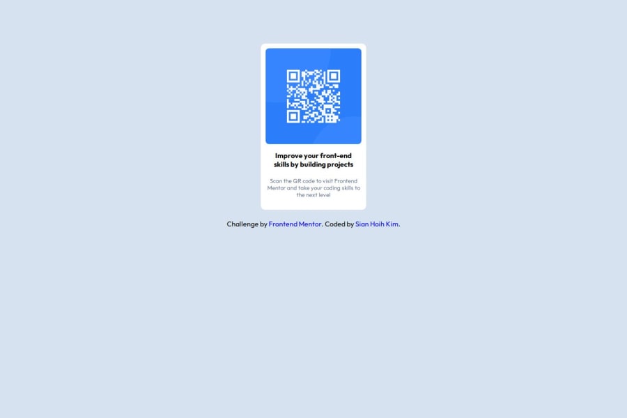
Design comparison
Solution retrospective
Firstly, I am really glad that I finish the project faster than the previous one. Next time, I wish I can use less commends for CSS, cuz I feel like I can shorten them.
What challenges did you encounter, and how did you overcome them?The challenge was I couldn't able to make the qr code perfectly fit in the box and was struggle to make it looks nice. TvT
What specific areas of your project would you like help with?I would like to get help if there is a way that I can shorten the CSS commends.
Community feedback
- @ajasmine94Posted 5 months ago
I believe your code is really neat and well-written :)
The things I think you could improve on just as I did on mine are the ff.:
- learn the use of Flexbox . Others also pointed this out on my first solution and it helped greatly as you learn along since it is easier to center the elements or 'items' inside a container using this.
- try not to use px as well. I've also recently learned this one but the use of vh and rem is really helpful!
Marked as helpful0@kimkim200949Posted 4 months ago@ajasmine94 thank you very much for your suggestion, I will try out those tips.🤩
0
Please log in to post a comment
Log in with GitHubJoin our Discord community
Join thousands of Frontend Mentor community members taking the challenges, sharing resources, helping each other, and chatting about all things front-end!
Join our Discord
