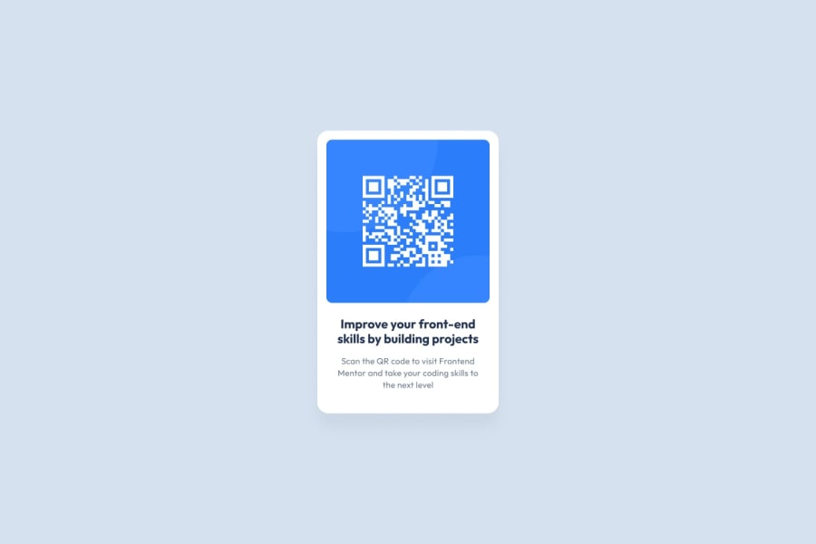
Design comparison
Community feedback
- @BaileyJaydonPosted 8 months ago
This is good, looks just like the example!
A few bits of advice:
-
The alt attribute for your image should be more descriptive for accessibility purposes. Instead of alt="", it could be something like alt="QR code leading to Frontend Mentor site" to better describe the image. This will help people using screen readers.
-
The <h3> tag in your HTML structure should be <h2> to be consistent with the CSS targeting, or the other way around (the h2 in the css should be h3).
Marked as helpful0 -
- @CodestephennPosted 8 months ago
Semantic HTML: The HTML structure is well-organized and uses semantic elements like
<div class="container">and<div class="content">. However, consider using more specific semantic elements like<main>,<section>, or<article>to define the content structure.Accessibility:
- The image has an alt attribute, which is great for screen readers.
Layout and Responsiveness:
- The container's absolute positioning might cause issues on smaller screens; consider using a more flexible layout approach.
Code Structure and Readability:
- The CSS is well-structured and easy to read.
- Consider grouping related styles together (e.g., all
.containerstyles) for better organization.
Design Comparison:
- The solution closely matches the design, but some minor adjustments could be made to perfect the layout and spacing.
Overall, great job on this project! With some minor improvements, it can be even more accessible, responsive, and maintainable. Keep up the good work!
Marked as helpful0
Please log in to post a comment
Log in with GitHubJoin our Discord community
Join thousands of Frontend Mentor community members taking the challenges, sharing resources, helping each other, and chatting about all things front-end!
Join our Discord
