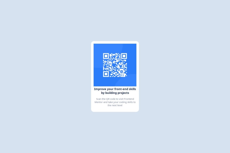
Design comparison
Solution retrospective
I am feeling proud to complete this solution and hoping that want to, solve the solution from the next time onwards with the minimal coding.
What challenges did you encounter, and how did you overcome them?Because of it was my first challenge in frontend mentor i completed this through by some references for the paths to solve.
Community feedback
- P@giropa832Posted 5 months ago
Hi,
This is a great first approach. I am reviewing your solution and I'd like to point some details:
- Look at the design system (fonts, colours)
- Try to make the design as pixel perfect as possible. Sizes don't correspond to each other.
Maybe try to do it with Vanilla CSS and HTML first?
I wish you the best of luck
Marked as helpful1 - P@Islandstone89Posted 5 months ago
Hey, good job!
Here is my feedback - I hope it is clear and helpful :)
HTML:
-
Every webpage needs a
<main>that wraps all of the content, except for<header>andfooter>. This is vital for accessibility, as it helps screen readers identify a page's "main" content. Change.wrapperto a<main>. -
The image has meaning, so it must have proper alt text. Write something short and descriptive, without including words like "image" or "photo". Screen readers start announcing images with "image", so an alt text of "image of qr code" would be read like this: "image, image of qr code". The alt text must also say where it leads(the frontendmentor website). A good alt text would be "QR code leading to the Frontend Mentor website."
-
I would change the heading to a
<h2>- a page should only have one<h1>, reserved for the main heading. As this is a card heading, it would likely not be the main heading on a page with several components. -
.attributionshould be a<footer>, and you should use<p>for the text inside.
CSS:
-
Including a CSS Reset at the top is good practice.
-
The font is not showing because you have a typo in your CSS:
--ff: 'Outfit'. 'inter', sans-serif;must be changed to:
--ff: 'Outfit', 'inter', sans-serif;-
I recommend adding a bit of
padding, for example16px, on thebody, to ensure the card doesn't touch the edges on small screens. -
Move the styles on
.wrapperto thebody. Changeheighttomin-height: 100svh- this way, the content will not get cut off if it grows beneath the viewport. Addflex-direction: column,justify-content: centerandgap: 2rem. -
Remove
margin-inline: autoon the card ,it is not needed, since it is centered using Flexbox. -
max-widthon the card should be in rem. Around20remwill work fine. -
font-sizemust never be in px. This is a big accessibility issue, as it prevents the font size from scaling with the user's default setting in the browser. Use rem instead. -
Since all of the text should be centered, you only need to set
text-align: centeron the body, and remove it elsewhere. The children will inherit the value. -
You can remove
font-weight: 400on thebody, as that is the default value. -
The paragraph text has poor contrast - if you hover over it in DevTools, it shows a contrast ratio of
3.62. It must be at least4.5to fulfill the minimum requirements from the Web Content Accessibility Guidelines. -
On the image, add
height: auto, and changedisplay: inline-blocktodisplay: block. Add aborder-radiusof for example16pxto give it rounded corners. Finally, addmargin-bottom: 1remto create breathing room between the image and the text.
Marked as helpful0 -
Please log in to post a comment
Log in with GitHubJoin our Discord community
Join thousands of Frontend Mentor community members taking the challenges, sharing resources, helping each other, and chatting about all things front-end!
Join our Discord
