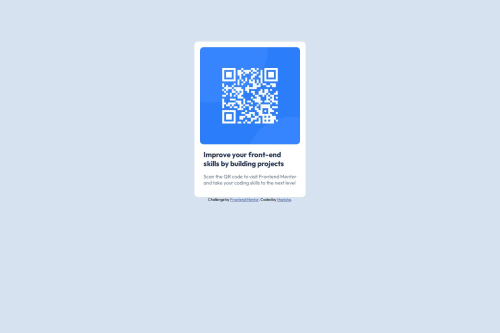
Submitted about 1 year agoA solution to the QR code component challenge
QR-code-component-main
@Manisha3196

Solution retrospective
What challenges did you encounter, and how did you overcome them?
I did not encounter one challenge that is normally we apply the width and height to containers but in this project when i applied width and height in the .container CSS style.It didn't fix anything.I struggled with it and applied to body lastly.It worked but honestly i don't know why it worked. Can anyone suggest me why it worked?
Is it because using flexbox or any other style that i didn't do correctly.
Thank you for the response.
What specific areas of your project would you like help with?I need help with semantic HTML and accessibility properties.
Code
Loading...
Please log in to post a comment
Log in with GitHubCommunity feedback
No feedback yet. Be the first to give feedback on Manisha3196's solution.
Join our Discord community
Join thousands of Frontend Mentor community members taking the challenges, sharing resources, helping each other, and chatting about all things front-end!
Join our Discord