

Design comparison

Community feedback
- P@Islandstone89Posted 7 months ago
HTML:
-
Every webpage needs a
<main>that wraps all of the content, except for<header>andfooter>. This is vital for accessibility, as it helps screen readers identify a page's "main" section. Wrap the card in a<main>. -
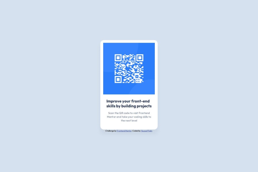
The alt text must also say where it leads(the frontendmentor website). A good alt text would be "QR code leading to the Frontend Mentor website."
-
I would change the heading to a
<h2>- a page should only have one<h1>, reserved for the main heading. As this is a card heading, it would likely not be the main heading on a page with several components. -
Do not use
<br>to force text onto a new line. The text should flow naturally, and all styling, including space between elements, should be done in the CSS. -
Wrap the footer text in a
<p>.
CSS:
-
Including a CSS Reset at the top is good practice.
-
I would recommend adding
1remofpaddingon thebody, to ensure the card doesn't touch the edges on small screens. -
On the
body, changeheighttomin-height- this way, the content will not get cut off if it grows beneath the viewport. Also, remove thewidthand addgap: 2rem, to create space between the main and the footer. And you don't needfont-weight: 400, as that is the default. -
Remove all widths and heights in
px. We rarely want to give a component a fixed size, as we want it to grow and shrink according to the screen size. -
We do want to limit the width of the card, so it doesn't get too wide on larger screens. Give the card a
max-widthof around20remto solve this issue. -
font-sizemust never be in px. This is a big accessibility issue, as it prevents the font size from scaling with the user's default setting in the browser. Use rem instead. -
letter-spacingmust also not be inpx. You can useem, where1emequals the element's font size. -
Since all of the text should be centered, you only need to set
text-align: centeron the body, and remove it elsewhere. The children will inherit the value. -
Likewise, set
font-familyon hebody, and remove it anywhere else. Remember that typographic properties usually get inherited through an element's ancestor. -
Paragraphs have a default value of
font-weight: 400, so there is no need to declare it. -
On the image, add
display: blockandmax-width: 100%- the max-width prevents it from overflowing its container. Without this, an image would overflow if its intrinsic size is wider than the container.max-width: 100%makes the image shrink to fit inside its container. Removeflex-shrink, it is not needed. And it's usual to setheight: autoon images. -
On the footer ,
align-items: flex-endandjustify-content: enddoesn't work unless you also declaredisplay: flex. However, it is not needed, so I would delete those styles altogether. -
As the design doesn't change, there is no need for any media queries. When you do need them, they should be in
remorem, not px. Also, it is common practice to do mobile styles first and use media queries for larger screens.
Marked as helpful1@Youssef-fPosted 6 months ago@Islandstone89 Thank you for your thoughtful and detailed feedback! I really appreciate the time you've taken to go over both the HTML and CSS aspects of the challenge.
For the HTML:
Wrapping the content in a <main> is a great point for accessibility. I'll definitely update that to make sure screen readers can easily identify the primary content. The suggestion for the alt text is spot-on—I'll update it to "QR code leading to the Frontend Mentor website" to provide better context for screen readers. Changing the heading to <h2> makes sense as there could be other sections on the page, and I agree that each page should only have one <h1>. Noted on avoiding the <br> tags for line breaks. I'll handle spacing through CSS, keeping the markup clean and semantic. Wrapping the footer text in a <p> is a great tip for maintaining proper structure. For the CSS:
Adding a CSS reset is a habit I’ll adopt going forward. I can see how it ensures a consistent baseline across browsers. Good call on the padding for the body, especially for mobile screens—I'll make sure the card doesn't touch the edges. I will switch height to min-height to avoid content getting cut off, and removing the explicit widths makes total sense for responsive design. I'll also implement gap: 2rem for spacing between the main and footer. I'm also going to switch to relative units (rem for font-size, em for letter-spacing) to improve accessibility and ensure responsiveness. The max-width: 100% and display: block on images is a great point, especially for keeping them responsive—I'll adjust the image styling as you suggested. I appreciate the reminder about not needing align-items and justify-content without display: flex. I'll clean that up in the footer. Lastly, I'll make sure everything is responsive by default without needing media queries, sticking to mobile-first styles.
Thanks again for your valuable input! I’m looking forward to implementing these changes and improving my approach for future projects.
1 -
- @AhmedEhab2022Posted 7 months ago
it is good but you can make the footer in the end of the screen and make text vertically start from same point
Marked as helpful0


Please log in to post a comment
Log in with GitHub
Join our Discord community
Join thousands of Frontend Mentor community members taking the challenges, sharing resources, helping each other, and chatting about all things front-end!
Join our Discord