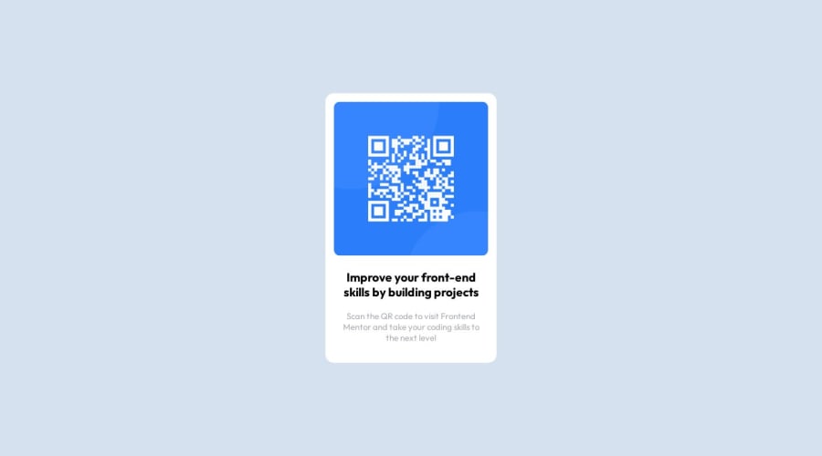
Design comparison
Solution retrospective
I would like to express my gratitude in advance to everyone who takes the time to review and contribute to this project. Your expertise and insight is invaluable and thank you
Community feedback
- @fernandolapazPosted almost 2 years ago
Hi 👋, just a couple of things that may interest you:
- The main content of every page (the card in this case) should be wrapped with the
<main>tag.
- You might consider using relative units like rem or em since they are better for scalable layouts. Something simple to start with would be to convert to rem (1 rem equals the font size of the root element, 16px by default). Consider this suggestion especially for the
font-size.
- If you've already studied grid or flex, consider using it to center the card on the page instead of the method you chose, for example like this:
body {
min-height: 100vh;
display: grid;
place-content: center;
}
And in this way you will avoid the page to be cut off in viewports with small height (such as mobile landscape orientation).
I hope it’s useful : )
Regards,
Marked as helpful1@Ali-El-ShoraaPosted almost 2 years agoThank you very much I will take your advice on everything you said @fernandolapaz
1 - The main content of every page (the card in this case) should be wrapped with the
- @mehdilightPosted almost 2 years ago
It looks good, but I noticed that the text color of the heading is not the same one used in the design.
0@Ali-El-ShoraaPosted almost 2 years agoI try to look like the one in the design as much as possible, thank you @mehdilight
0
Please log in to post a comment
Log in with GitHubJoin our Discord community
Join thousands of Frontend Mentor community members taking the challenges, sharing resources, helping each other, and chatting about all things front-end!
Join our Discord
