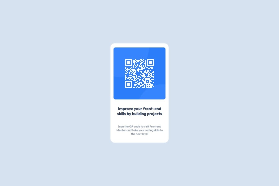
Design comparison
Solution retrospective
I'm proud of that I started and tried to solve problems and next time I'll think more
What challenges did you encounter, and how did you overcome them?Frist time to solve a css and html problem , I tried thinking but it was my frist time to solve something like that
What specific areas of your project would you like help with?css
Community feedback
- @SvitlanaSuslenkovaPosted 2 months ago
body { display: flex; flex-direction: column; justify-content: center; align-items: center; min-height: 100vh; } Try this to align(top-bottom) and justify(left-right) your project to the center. It applies to the parent component(body), don't forget about !!min-height!!. You can use grid instead of flex too.
Marked as helpful0@OmarRafat975Posted about 2 months agothank you <3 it's really helpful @SvitlanaSuslenkova
0 - @MikDra1Posted 2 months ago
If you want to make your card responsive with ease you can use this technique:
.card {
width: 90%;
max-width: 37.5rem;
}
On the smaller screens card will be 90% of the parent (here body), but as soon as the card will be 37.5rem (600px) it will lock with this size.
Also to put the card in the center I advise you to use this code snippet:
.container {
display: grid;
place-items: center;
}
Hope you found this comment helpful 💗💗💗
Good job and keep going 😁😊😉
Marked as helpful0@OmarRafat975Posted about 2 months agothank you I'll try it and you've been really helpful <3@MikDra1
0
Please log in to post a comment
Log in with GitHubJoin our Discord community
Join thousands of Frontend Mentor community members taking the challenges, sharing resources, helping each other, and chatting about all things front-end!
Join our Discord
