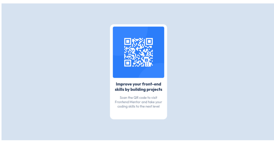
Design comparison
Solution retrospective
This project made me review CSS and HTML, and I'm honestly a bit unsure about the text-align property, I understand its function but I feel like I need more experience with working it out.
Community feedback
- @MelvinAguilarPosted almost 2 years ago
Hi there π. Good job on completing the challenge ! I have some feedback for you if you want to improve your code.
HTML Structure:
I noticed that your html file does not have the basic structure of a web page (html, head, body) and it is missing the
<!DOCTYPE html>
declaration. You can read more about this here.<!DOCTYPE html> <html lang="en"> <head> <meta charset="UTF-8"> <meta http-equiv="X-UA-Compatible" content="IE=edge"> <meta name="viewport" content="width=device-width, initial-scale=1.0"> <title>Title</title> </head> <body> <! -- Main content of website --> </body> </html>
You can read more about this here
HTML:
- The
lang
attribute is used to declare the language of the webpage. Create an <html> tag and add thelang
attribute to the<html>
tag with the valueen
.
- The
viewport
meta tag is missing. theviewport
meta tag is used to control the layout of the page on mobile devices. Add theviewport
meta tag to the<head>
tag:<meta name="viewport" content="width=device-width, initial-scale=1.0">
- Use the
<main>
tag to wrap all the main content of the page instead of the<div>
tag. With this semantic element you can improve the accessibility of your page.
- You must use a level-one heading (h1) even though this is not a full-page challenge. You can create an '<h1>' element within your 'main' element that will be hidden visually but visible and readable by screen readers. The class "sr-only" hides content visually and here are the styles to copy. e.g.:
<h1 class="sr-only">QR Card Component</h1>
I hope you find it useful! π Above all, the solution you submitted is great!
Happy coding! π
Marked as helpful2 - The
- @0xabdulkhaliqPosted almost 2 years ago
Hi there π:
- We gladly welcome you to the Front end mentor community
- You just completed a solution as per the design Congratulations..π
- But, There's an report in accessibility which causes accessibility error
RESOLVING THE ERROR
<html>
must have language attribute which improves accessibility so change it to<html lang="en">
- And then provide alt text to
img
element by doing this <img src="image-qr-code.png" alt="qr-code">
- The
div
with class.parent
is meant to be amain
element - Because using semantical elements to structure the HTML improves the accessibility for screen readers
- So change the
div
intomain
element
MESSAGE:
- If my answer helps you then providing an upvote will be very helpfull
- And don't forget to mark this comment as helpfull. If it helps to resolve your issues
- I hope you learned a lot of stuffs during this project, Congrats Carolyn
GREETINGS:
- Happy coding..π
- Peace be upon you with god's mercy & blessings..β¨
Marked as helpful2 - @y25sanchezPosted almost 2 years ago
Great job Carolyn!
I have some recommendations to improve your code...
The best way to center the QR code component is by applying some styles in the body. This will work only if you remove the positioning properties that you applied in the child and parent elements
body{ height: 100vh; width: 100%; display: flex; justify-content: center; align-items: center; font-family: 'Outfit'; background-color: hsl(212,45%,89%); }
The font family ''Outfit'' is the main font you can add it to the body so like that you don't have to repeat code.
Also you are missing some fundamental things in the structure of your html file.
<!DOCTYPE html> <html lang="en"> <head> <meta charset="UTF-8" /> <meta http-equiv="X-UA-Compatible" content="IE=edge" /> <meta name="viewport" content="width=device-width, initial-scale=1.0" /> <title>Qr codep roject</title> <link rel="stylesheet" type="text/css" href="style.css" /> </head> <body> <div class="parent"> <div class="child"> <img src="image-qr-code.png" /> <h2>Improve your front-end skills by building projects</h2> <p> Scan the QR code to visit Frontend Mentor and take your coding skills to the next level </p> </div> </div> </body> </html>
Hope you a nice day! Keep up the good work!
Marked as helpful1@carolyngorskiPosted almost 2 years agothank you so much this was very helpful. I will adjust the body css @y25sanchez
0 - @HassiaiPosted almost 2 years ago
Replace <div class="parent"> with the main tag to fix the accessibility issues. for more on semantic html visit https://web.dev/learn/html/semantic-html/
To center .child on the page, add min-height:100vh; display: flex; align-items: center: justify-content: center; or min-height:100vh; display: grid place-items: center to .parent. Instead of giving .child position: relative and its properties.
Give .parent a height of 100%, width of 100% , padding: 0; and margin: 0; there is no need for position: relative in .parent
Use rem or em as unit for the padding, margin, width and preferably rem for the font-size for more on this watch this https://youtu.be/N5wpD9Ov_To
Hope am helpful HAPPY CODING
Marked as helpful1@carolyngorskiPosted almost 2 years agothank you so much the positioning feedback was very helpful and I will improve my code. @Hassiai
0
Please log in to post a comment
Log in with GitHubJoin our Discord community
Join thousands of Frontend Mentor community members taking the challenges, sharing resources, helping each other, and chatting about all things front-end!
Join our Discord