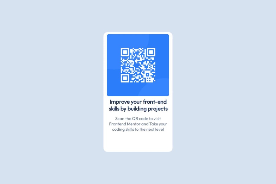


Design comparison
SolutionDesign

Solution retrospective
What are you most proud of, and what would you do differently next time?
I'm proud of being able to complete this completely independently. Next time, I want to spend more time planning out my workflow.
What challenges did you encounter, and how did you overcome them?Starting out was kind of overwhelming, but I was able to break the problem down into more digestible bits, which was nice.
What specific areas of your project would you like help with?I want to improve my ability to build things for many different screen sizes, instead of just one static size.
Community feedback
- @KseniiaMasnaPosted 3 months ago
I suggest following the design example more specifically. In this case, you could improve by setting space between the image and text according to the design provided as well as the bottom space of the card. Overall well done!
Marked as helpful1

Please log in to post a comment
Log in with GitHubJoin our Discord community
Join thousands of Frontend Mentor community members taking the challenges, sharing resources, helping each other, and chatting about all things front-end!
Join our Discord