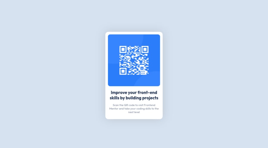
Design comparison
Solution retrospective
My approach to this was first to set up the page's overall HTML structure, then style it using CSS based on the mobile view.
Any feedback appreciated!
Community feedback
- @VCaramesPosted almost 2 years ago
Hey there! 👋 Here are some suggestions to help improve your code:
- FEM Best practice ✅, before moving on to the next challenge, always check your FEM report (It provides value information), to see what is incorrect and update your code with it so that you would not make the same mistake over again. This should be the first thing that should be done ⚠️ right after submitting the challenge.
- Every site should ALWAYS have ✅ a
mainelement not only for semantic purposes but also to help assistive technology find the main content of your content. For this challenge, it will serves as the component’s container ⚠️.
More Info: 📚
- The
alt tagdescription for the “QR image” needs to be improved upon ⚠️. Its needs to tell screen reader users what it is and where it will take them to when they scan it.
- The "Improve your front-end skill by building projects" is a heading ⚠️ in this component, so should be wrapped in an heading element.
- Change ⚠️
widthtomax-widthin your component’s container to make it responsive.
If you have any questions or need further clarification, feel free to reach out to me.
Happy Coding! 🤖
Marked as helpful1 - @jrleijnsePosted almost 2 years ago
Hey there! Great job completing your first challenge! 🎊
I have some suggestions for your code that might interest you.
HTML 📄:
- Instead of using the
<div>tag for your containers, try using some semantic HTML to provide more meaning to it, for better SEO. For example, instead of using<div>you could use the<main>or<section>tag. For the element with the classname attribution you could use the<footer>tag. - If an
<img>like in this case the QR-code, leads to a website or links to someplace else, try to provide a more descriptive text of that in yourALTtext, for example: QR code that leads to frontendmentor.io
CSS 🎨:
- To make your solution responsive for different devices and screen widths, you can create a media query inside your CSS file and set the breaking point (i.e. the moment your media query gets triggered based on the width of the viewport). For example:
@media (max-width: 375px) { ***Place your CSS code here, just like you would in a regular CSS file***}.
For more information on this topic, you can read the following article: Media queries 📘
I hope you find my suggestions useful, and above all: the solution you provided is very good!
Keep it up and happy coding! 😃
Marked as helpful1 - Instead of using the
Please log in to post a comment
Log in with GitHubJoin our Discord community
Join thousands of Frontend Mentor community members taking the challenges, sharing resources, helping each other, and chatting about all things front-end!
Join our Discord
