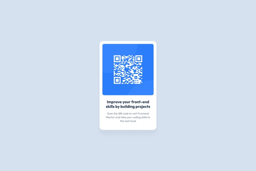
Design comparison
Solution retrospective
- What did you find difficult while building the project?
- Centering Element is still pretty annoying to handle
Community feedback
- @correlucasPosted about 2 years ago
👾Hello @mrxshinji, Congratulations on completing this challenge!
Your solution its almost done and I’ve some tips to help you to improve it:
1.You’ve used
<div>to wrap the card container, in this case you need to use<main>since this is the main block of this page.2.Every page needs a main heading, the
<h1>to show which is the most important heading. You need to increase the headings by one level, like h1, h2, h3 to show the titles hierarchy. Remember that you cannot have more than one h1 heading.3.Add the
alt textto allow screen readers to recognize that img. Adding alternative text to photos is first and foremost a principle of web accessibility. Visually impaired users using screen readers will be read an alt attribute to better understand an on-page image.✌️ I hope this helps you and happy coding!
Marked as helpful1 - @AdrielMurrayPosted about 2 years ago
Great work @mrxshinji your project looks nearly identical. You can reduce the boldness of your
<h2>and start learning how to usemedia queriesto make your projects responsive for mobile.**Happy Coding ✌️ **
1
Please log in to post a comment
Log in with GitHubJoin our Discord community
Join thousands of Frontend Mentor community members taking the challenges, sharing resources, helping each other, and chatting about all things front-end!
Join our Discord
