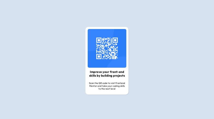
Design comparison
Solution retrospective
I find it so difficult to center content. Anyone have any tip to center webpage content properly?
Community feedback
- @Durga-JaiswalPosted about 1 year ago
Hello, Good to see your Project. To make the card center aligned with the body, you can follow these as
display: flex
justify-content: center
align-items: center
This will make your card component center aligned.
3@bccpadgePosted about 1 year ago@Durga-Jaiswal
Also you can add a
min-height:100vh;alongside three Flexbox properties.When you add
height:100vh;on smaller devices the component is cut off and you can’t scroll up or down the page.Hope you find this useful
1 - @adrnmatosPosted about 1 year ago
Hello. This way you can center horizontal and vertical dimensions. .card { position: absolute; top: 50%; left: 50%; transform: translate(-50%, -50%); }
This is a good resource: https://www.freecodecamp.org/news/css-vertical-align-how-to-center-a-div-text-or-an-image-example-code/
1
Please log in to post a comment
Log in with GitHubJoin our Discord community
Join thousands of Frontend Mentor community members taking the challenges, sharing resources, helping each other, and chatting about all things front-end!
Join our Discord
