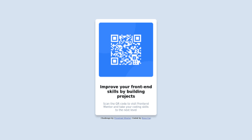
Design comparison
Solution retrospective
Cualquier critica es buena para ir avanzando :)
Community feedback
- @Perr0fe0Posted about 2 years ago
hola buenas!. El diseño esta perfecto, en las únicas cosas que te puedo aconsejar es que muevas el archivo del CSS a una carpeta y que también coloques comentarios en tu codigo para que te puedas guiar y puedas recordar que es lo que hace tal linea. Sé que esta carta QR es una actividad pequeñita, pero aplicando lo que te aconsejo en un proyecto real, puede salvarte en mas de una.
pd: Recomiendo que veas el como usar custom properties en CSS, me ayuda mucho a agilizar al momento de seleccionar colores, tamaños, fuentes y otras cosas. Te dejo aquí un link para que lo puedas ver!. https://developer.mozilla.org/es/docs/Web/CSS/Using_CSS_custom_properties
mucha suerte!.
Marked as helpful2@RosaCardenalPosted about 2 years ago@Perr0fe0 Hola Alexander :) Le echaré un ojo. Mil gracias por tus consejos
0 - @KelvinMvungiPosted about 2 years ago
Good work. I suggest that you try to organize your code a little better, reduce the unnecessary spaces and new lines also keep everything properly indented, it will help you in large projects where there are a thousands lines of code for things like debugging e.t.c. Please learn to use semantics tags, they help the search engine and the visual impared. The following link might be helpful semantic elements
Marked as helpful0@RosaCardenalPosted about 2 years ago@KelvinMvungi Thank you very much for your contribution :)
0 - @correlucasPosted about 2 years ago
👾Hi Rosa, congratulations on your solution!👋 Welcome to the Frontend Mentor Coding Community!
Great solution and a great start! From what I saw you’re on the right track. I’ve few suggestions for you that you can consider adding to your code:
- Use
<main>
instead of a simple<div>
this way you improve the semantics and accessibility showing which is the main block of content on this page. Remember that every page should have a<main>
block and that<div>
doesn't have any semantic meaning. - Replace the
<h2>
containing the main title with<h1>
note that this title is the main heading for this page and every page needs one h1 to show which is the most important heading. Use the sequence h1 h2 h3 h4 h5 to show the hierarchy of your titles in the level of importance, never jump a level. - Add a margin of around
margin: 20px
to avoid the card touching the screen edges while it scales down. - Use relative units as
rem
orem
instead ofpx
to improve your performance by resizing fonts between different screens and devices. These units are better to make your website more accessible. REM does not just apply to font size, but to all sizes as well.
Here's my solution for this challenge if you wants to see how I build it: https://www.frontendmentor.io/solutions/qr-code-component-vanilla-cs-js-darklight-mode-nS2aOYYsJR
✌️ I hope this helps you and happy coding!
0@RosaCardenalPosted about 2 years ago@correlucas Hi Lucas, Thank you very much for your notes. I will do it again. I will review your code to learn :)
0 - Use
Please log in to post a comment
Log in with GitHubJoin our Discord community
Join thousands of Frontend Mentor community members taking the challenges, sharing resources, helping each other, and chatting about all things front-end!
Join our Discord