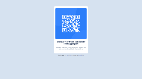
Design comparison
Solution retrospective
In this case my problems were related to image sizing when it's related to the margins of the cointainers. Sometimes I was using padding and others margin, but the final result was quite good for me!
Community feedback
- @johnhaabPosted almost 2 years ago
I removed the <div class="attribution"> in mine as it caused issues.
And to center the content better you should add min-height:100vh; to the body. And reduce the width value of main_container.
I am new so take what I say with a grain of salt but it worked well for me on this. <3
Marked as helpful1 - @HassiaiPosted almost 2 years ago
Replace <div class="attribution"> with the footer tag, this will fix the accessibility issues
To center a content on the page, remove flex-direction value, flex-wrap value and margin-top value in the body. , Add min-height:100vh; to the body. Reduce the width value of main_container, Give it a padding value .
There is no need for a padding value , display: flex; and its properties. Give .qr-code a width of 100% instead of width:60vw;
Hope am helpful Well done for completing this challenge. HAPPY CODING
Marked as helpful1 - @lucasbailoPosted almost 2 years ago
Other problem that I noticed is that the image is not in the center of the screen, and I tried to do a lot of things to fix it, without success yet. But as I'm learning and improving my skills, I'll come back here to fix my old codes!
1@HassiaiPosted almost 2 years ago@lucasbailo with more experience and time it will become very easy, well done for completing this challenge , you have done a good job. Happy coding
1
Please log in to post a comment
Log in with GitHubJoin our Discord community
Join thousands of Frontend Mentor community members taking the challenges, sharing resources, helping each other, and chatting about all things front-end!
Join our Discord