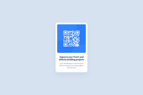
Submitted about 1 year agoA solution to the QR code component challenge
QR Code | Component
@lucasterencio

Solution retrospective
What are you most proud of, and what would you do differently next time?
The html semantic and, for sure, all correct gaps between elements. Next time, i wish improve the project structure.
What challenges did you encounter, and how did you overcome them?i confess that the filters in css was a new knowledge! I enjoy it.
Code
Loading...
Please log in to post a comment
Log in with GitHubCommunity feedback
No feedback yet. Be the first to give feedback on lucasterencio's solution.
Join our Discord community
Join thousands of Frontend Mentor community members taking the challenges, sharing resources, helping each other, and chatting about all things front-end!
Join our Discord