

Design comparison
SolutionDesign

Community feedback
- @MelvinAguilarPosted almost 2 years ago
Hi there 👋. Good job on completing the challenge ! I have some feedback for you if you want to improve your code.
HTML:
- Use the
<main>tag to wrap all the main content of the page instead of the<div>tag. With this semantic element you can improve the accessibility of your page.
- Use the
<footer>tag to wrap the footer of the page instead of the<div class="attribution">. The<footer>element contains information about the author of the page, the copyright, and other legal information.
- You must use a level-one heading (h1) even though this is not a full-page challenge. You can create an '<h1>' element within your 'main' element that will be hidden visually but visible and readable by screen readers. The class "sr-only" hides content visually and here are the styles to copy. e.g.:
<h1 class="sr-only">QR Card Component</h1>
- Always avoid skipping heading levels; Always start from
<h1>, followed by<h2>, and so on up to <h6> (<h1>,<h2>,...,<h6>). Swap the<h3>tag with<h2>
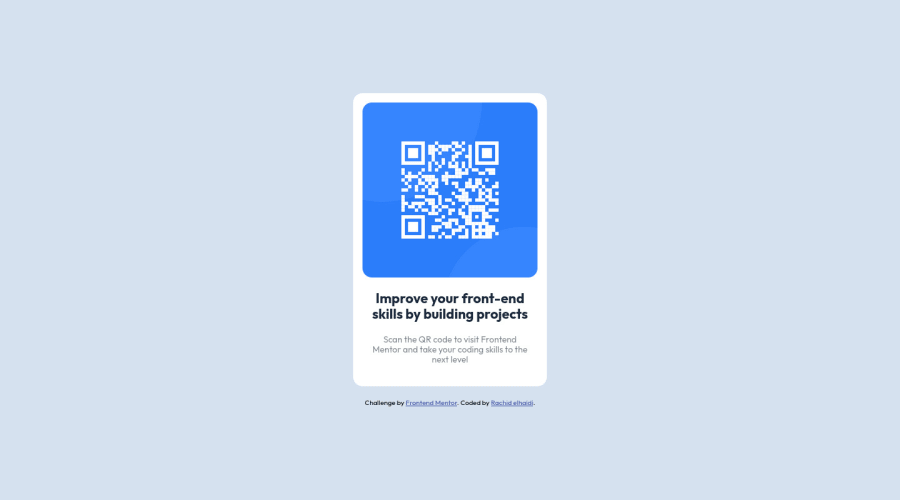
- Since this component involves scanning the QR code, the image is not a decoration, so it must have an
altattribute. Thealtattribute should explain its purpose. e.g.QR code to frontendmentor.io
CSS:
- Instead of using pixels in font-size, use relative units like
emorrem. The font-size in absolute units like pixels does not scale with the user's browser settings. This can cause accessibility issues for users who have set their browser to use a larger font size. You can read more about this here.
- Use
max-width: 310pxto.cardselector instead ofwidth, this will make the container card a bit responsive on mobile and set the element's maximum width to 310px.
- Update the image selector to make responsive images:
.card img {
    width: 100%;
    /* width: 280px; */
    border-radius: 15px;
    margin-bottom: 20px;
}
I hope you find it useful! 😄 Above all, the solution you submitted is great!
Happy coding and Happy New Year! 🎉🎊🎁
Marked as helpful0@Rachid02elhaidiPosted almost 2 years ago@MelvinAguilar thank's a lot, i will apply this in my next challenges
1 - Use the

Please log in to post a comment
Log in with GitHub
Join our Discord community
Join thousands of Frontend Mentor community members taking the challenges, sharing resources, helping each other, and chatting about all things front-end!
Join our Discord