Design comparison
Community feedback
- @KristinaHorbenkoPosted 6 months ago
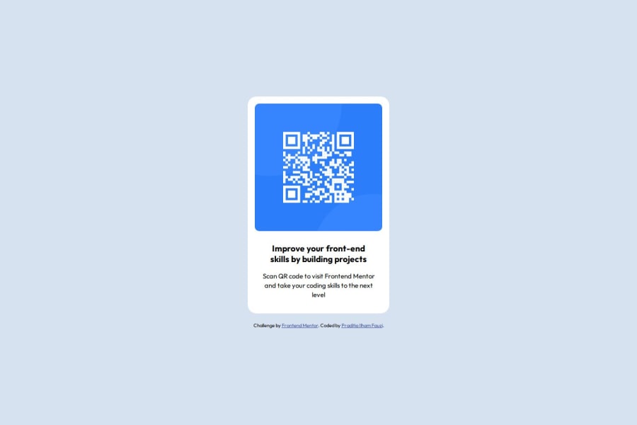
The code is structured and readable. The use of CSS variables makes it more flexible and manageable. However, it is worth paying attention to the consistency in the use of indents and whitespace to improve the overall appearance of the code. The solution is consistent with the given project, although it is worth paying attention to details such as indents, sizes and styles to match the layout 100%. Some design improvements such as shadows or borders can make the card more attractive.
0
Please log in to post a comment
Log in with GitHubJoin our Discord community
Join thousands of Frontend Mentor community members taking the challenges, sharing resources, helping each other, and chatting about all things front-end!
Join our Discord
