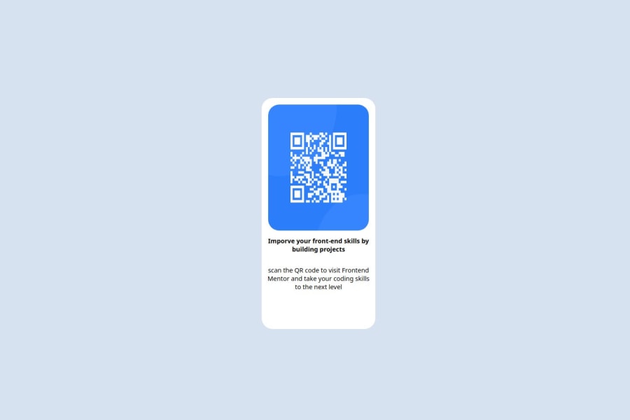
Not Found
Not Found
Not Found
Not Found
Not Found
Not Found
Not Found
Not Found
Not Found
Not Found
Not Found
Not Found
Not Found
Not Found
Not Found
Not Found
Not Found
Not Found
Not Found
Not Found

Submitted

QR Code Component

@LeeWhoCodes

Desktop design screenshot for the QR code component coding challenge

This is a solution for...

  • HTML
  • CSS
1newbie
View challenge

Design comparison


SolutionDesign

Solution retrospective


What are you most proud of, and what would you do differently next time?

I am most proud of the fact that I got it looking good on a desktop and also on a mobile. It is not perfect and could definitely do with some refinement but I am proud of it. Next time I would like to find a better way to size and position my elements so that it is less manual to change the sizes of elements.

What challenges did you encounter, and how did you overcome them?

I struggled with the component being completely wrong on a mobile device. To overcome this I used media queries and changed the values so that it looked good on mobile. I also struggled with having to do a lot of sizing and position manually. I didn't really overcome this very well but I am hoping to find a better way to do it in the future.

What specific areas of your project would you like help with?

I would love help with figuring out a better way to do spacing, positioning and sizing. I belive this would also help with my other problem of my component being unreadable on different devices.

Community feedback

P
Steven Stroud 11,810

@Stroudy

Posted

Exceptional work! You’re showing great skill here. I’ve got a couple of minor suggestions that could make this stand out even more…

  • Avoid using id selectors for styling in CSS because they are too specific and hard to override, making your styles less flexible and maintainable. Instead, use class selectors (.), which are reusable and more manageable, allowing for better control over your styles and easier updates.

  • Using a <main> tag inside the <body> of your HTML is a best practice because it clearly identifies the main content of your page. This helps with accessibility and improves how search engines understand your content.

  • Using a full modern CSS reset is beneficial because it removes default browser styling, creating a consistent starting point for your design across all browsers. It helps avoid unexpected layout issues and makes your styles more predictable, ensuring a uniform appearance on different devices and platforms, check out this site for a Full modern reset

  • Using rem or em units in @media queries is better than px because they are relative units that adapt to user settings, like their preferred font size. This makes your design more responsive and accessible, ensuring it looks good on different devices and respects user preferences.

@media (max-width: 800px)
  • For future project, You could download and host your own fonts using @font-face improves website performance by reducing external requests, provides more control over font usage, ensures consistency across browsers, enhances offline availability, and avoids potential issues if third-party font services become unavailable. Place to get .woff2 fonts

I hope you’re finding this guidance useful! Keep refining your skills and tackling new challenges with confidence. You’re making great progress—stay motivated and keep coding with enthusiasm! 💻

0
Huy Phan 1,880

@huyphan2210

Posted

Hi, @LeeWhoCodes

I took a look at your solution and have some thoughts:

  • You mentioned struggling with styling the component for mobile devices. I’m guessing you started with desktop-first styling. If that’s the case, I’d recommend researching the mobile-first approach. It involves designing for smaller screens first and scaling up, which often results in more responsive and flexible layouts.
  • Regarding the sizing issues, I’d suggest looking into CSS properties like width, height , font-size, and relative units. These are critical for building responsive designs, and it looks like they might be causing the layout to become "unreadable" on various devices.
  • For spacing and positioning issues, I’d recommend doing some research on padding, margin, flexbox, and grid, as they can greatly improve layout control and responsiveness.

You can also explore design systems like Material Design by Google or Ant Design by Alibaba for inspiration. They provide ready-made design principles and components to help guide your styling decisions.

Hope this helps!

0
auniraden 10

@auniraden

Posted

Great job on your HTML and CSS! The layout is clean and responsive, which is fantastic. To enhance accessibility, consider using more semantic HTML elements like <header> and <main> for better context, and don’t forget to check color contrasts for readability. Using viewport units is a smart choice, but test how everything looks on different screen sizes to ensure a seamless experience. It’s awesome that you’re already using CSS variables and media queries; these are great tools for managing spacing, positioning, and sizing! Utilizing flexbox or CSS Grid can also help create more dynamic layouts that adapt well across devices. For spacing, CSS variables can help maintain consistent margins and padding, making it easier to manage styles throughout your project. Keep experimenting with these techniques, and you’ll find the best approach for enhancing the usability of your components. Overall, you’re on the right track—just keep an eye on aligning the layout with the original design and make those small tweaks for an even better result. Keep up the awesome work!

0

Please log in to post a comment

Log in with GitHub
Discord logo

Join our Discord community

Join thousands of Frontend Mentor community members taking the challenges, sharing resources, helping each other, and chatting about all things front-end!

Join our Discord