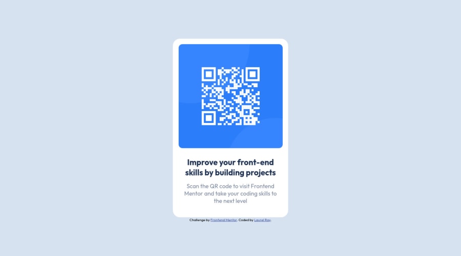
Design comparison
Solution retrospective
Hi, this is my first non-tutorial led project after a long period of not building anything at all, so I'm easing myself back in. I was a bit unsure of my positioning. I had a really hard time positioning my footer. It was showing up at the top of the screen, I was finally able to put it beneath the card by placing the footer inside the <main> and setting it to absolute position. Didn't seem like the best solution.
I also was unsure if there was a better way to position my qr code image.
I'm open to any suggestions at all and appreciate any feedback.
Thanks in advance for taking the time to have a look.
Community feedback
- @elaineleungPosted about 2 years ago
Hi Laurel, glad to hear you've made it back to building projects, which I can definitely relate since I just got back myself around two months ago! 😊
Anyway, about the positioning, your footer ended up at the top most likely because you had the
position: absolute
on the main element. I generally advise against usingposition: absolute
for centering elements when there are other alternatives; I think the only time I'd use absolute positioning is when there's something in the design that involves overlapping elements, or basically something that I can't do otherwise with grid or flexbox. Instead of usingposition: absolute
, you can use grid or flexbox on the body selector, and by doing that, you also can place the footer element under the main element instead of inside it, which as you said, isn't something that's best to do!In addition to using grid/flexbox, here are my suggestions just from looking at the code:
-
Remove all the absolute positioning elements (including transform, margin-right, etc.) in both the main and footer, and make the body selector a grid. I'm only using grid because it's less code and I wanted to keep things short, but I normally use flexbox out of habit. You can use flexbox also if you like, and if you do, all you need to do after adding the centering properties in body is just add
flex: 1
to main! -
On
main
, remove the white background and border radius, and add these two properties to.card
instead. You'd want the main to be a container and not the actual component. Also addalign-self: center
for positioning since grid is being used. -
To fix the lack of responsiveness, we'd need to change the fixed properties by changing
width: 36rem
tomax-width: 36rem
on the main; on theimg
, change the width from32.5rem
to100%
, and remove the margin-top. To create spacing around the image and text inside the card, simply addpadding: 1.6rem
(or whatever value) to the.card
selector.
Everything together looks like this:
body { display: grid; grid-template-rows: auto min-content; justify-content: center; // rest of your code } main { max-width: 36rem; align-self: center; // for vertical alignment using grid margin: 1rem; // for spacing around the card } .card { background-color: white; border-radius: 2.2rem; padding: 1.6rem; // rest of your code (you can actually try removing flexbox) } .card-image img { width: 100%; // remove margin-top // rest of your code }
Anyway, hope this helps you out, and keep going Laurel, you're doing great! 😊
Marked as helpful1@laurel-rayPosted about 2 years ago@elaineleung Thank you for your time and for the encouragement! This solution was really useful and has given me the nudge I need to finally learn grid.
0 -
- @JorggyhPosted about 2 years ago
It took me a while to elaborate on the answer, maybe @PaletteJack has already touched on these points, but here goes:
Your code had a </div> tag left over on line 39.
The way you centered the card is very useful, but for other occasions (usually when we want something to overlap something else) but not for this one.
Remove
position: relative;
from the body and remove this from inside main:position: absolute; top: 50%; left: 50%; margin-right: -50%; transform: translate(-50%, -50%);
This done, the card will be aligned on the top left.
Now you can center horizontally and vertically with:
body { display: flex; justify-content: center; /* horizontally */ align-items: center; /* vertically */ }
Now for the footer we can do it as follows, change:
position: absolute; left: 50%; margin-right: -50%; transform: translate(-50%);
For this:
position: absolute; bottom: 2rem; left: 50%; transform: translate(-50%);
About the image you had doubts if it was the best way, as you did it is good, another way would be to change:
img { width: 32.5rem; margin-top: 1.75rem; border-radius: 12px;
For this:
.card-image { padding: 1.75rem; } img { border-radius: 12px; width: 100%; }
Would have to remove the padding-top from the div below.
Marked as helpful1@laurel-rayPosted about 2 years ago@Jorggyh Thank you for taking the time to help me. I tried out your suggestions and it looks great.
0 - @PaletteJackPosted about 2 years ago
Hi Laurel, great job on the card! The styling looks spot on.
So to answer your question on positioning, I see that you used
position: absolute;
on your main tag to get the card in the middle. You can use that and transform, but what i think would help you out is to have your main tag cover the page, then use flex to position your content to the middle.For you main tag:
main { display: flex; width: 100%; height: 100vh; position: relative; align-items: center; justify-content: center; }
You would have to move the card styling of your main tag to your .card class:
.card { display: flex; width: 36rem; flex-direction: column; align-items: center; background-color: white; border-radius: 2.2rem; }
And finally since your main tag is now covering the page and we've set the position of the main tag to relative, you can use absolute positioning on the footer to set the position much easier:
.attribution { font-size: 11px; text-align: center; position: absolute; bottom: 0; left: 0; right: 0; }
You worked with what you had to complete it and it's to spec so great job! Hope to see more from you.
Marked as helpful1@laurel-rayPosted about 2 years ago@PaletteJack Thank you for taking the time to offer your help. This solution makes a lot of sense and it looked great when I implemented it. I'm grateful for your encouragement!
0 - @correlucasPosted about 2 years ago
👾Hello Laurel Ray, Congratulations on completing this challenge!
I saw your preview site and I liked a lot the work you’ve done here, it's almost complete, I’ve some suggestions you can consider applying to your code.The html structure is fine and works, but you can reduce at least 20% of your code cleaning the unnecessary elements, you start cleaning it by removing some unnecessary
<div>
. For this solution you wrap everything inside a single block of content using<div>
or<main>
(better option for accessibility) and put inside the whole content<img>
/<h1>
and<p>
.<body> <main> <img src="./images/image-qr-code.png" alt="Qr Code Image" > <h1>Improve your front-end skills by building projects</h1> <p>Scan the QR code to visit Frontend Mentor and take your coding skills to the next level</p> </main> </body>
✌️ I hope this helps you and happy coding!
Marked as helpful0@laurel-rayPosted about 2 years ago@correlucas Thank you for your suggestions. I appreciate you taking the time to help.
0
Please log in to post a comment
Log in with GitHubJoin our Discord community
Join thousands of Frontend Mentor community members taking the challenges, sharing resources, helping each other, and chatting about all things front-end!
Join our Discord