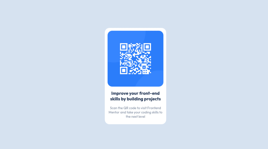
Design comparison
Community feedback
- @HassiaiPosted almost 2 years ago
Replace <div id="container"> with the main tag and <p id="naslov"> with <h1> to fix the accessibility issue. click here for more on web-accessibility and semantic html
There is no need to give the body a min-width value.
Use relative units like rem or em as unit for the padding, margin, width values and preferably rem for the font-size values, instead of using px which is an absolute unit. For more on CSS units Click here
Hope am helpful.
Well done for completing this challenge. HAPPY CODING
Marked as helpful0@PekinezerPosted almost 2 years ago@Hassiai Thanks for the response and the good pointers, i replaced the div with main and the p tag with h2 because h1 was just to big compared with the image i got from FM, usually i am using rem but right now i used px because the readme file had exactly 15px for font size even thou when comparing its more like 18px so px was used for everything. As far as the min-width value you are absolutely right there was no actual need for it. Hope everything is to standards now.
0
Please log in to post a comment
Log in with GitHubJoin our Discord community
Join thousands of Frontend Mentor community members taking the challenges, sharing resources, helping each other, and chatting about all things front-end!
Join our Discord
