Not Found
Not Found
Not Found
Not Found
Not Found
Not Found
Not Found
Not Found
Not Found
Not Found
Not Found
Not Found
Not Found
Not Found
Not Found
Not Found
Not Found
Not Found
Not Found
Not Found

Submitted

QR code component

@atomic-variable

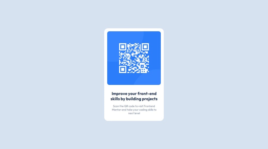
Desktop design screenshot for the QR code component coding challenge

This is a solution for...

  • HTML
  • CSS
1newbie
View challenge

Design comparison


SolutionDesign

Solution retrospective


What specific areas of your project would you like help with?

It is tough to figure out CSS properties from Figma when using the free version.

Community feedback

@DylandeBruijn

Posted

@atomic-variable

Hiya! 👋

Congratulations on your solution, it looks very close to the design! I can tell you put a lot of effort into it.

Things I like about your solution 🎉

  • Use of semantic HTML elements

Things you could improve ✍️

  • I suggest adding a bit of padding to your body element so the card has some space around it on smaller viewports.

  • Try experimenting with the CSS layout tool Flexbox, it will help you greatly structuring elements on your webpage.

  • You could add a min-height: 100vh to your body element so it takes up the full height of the viewport while still being able to grow when the content inside it grows.

  • Try experimenting with CSS variables, they help you make your CSS values more reusable across your code.

  • I suggest using clear descriptive CSS classes like .card, .card-title and .card-description.

  • I don't think content is a valid HTML element, try using p for your card description.

  • Try making your card responsive.

I hope you find my feedback valuable, and I would appreciate it greatly if you could mark my comment as helpful if it was! 🌟

Let me know if you have more questions and I'll do my best to answer them. 🙋‍♂️

Happy coding! 😎

0

@atomic-variable

Posted

Hi @DylandeBruijn

Thank you for your review. Please find my response below.

I suggest adding a bit of padding to your body element so the card has some space around it on smaller viewports. - Sure

Try experimenting with the CSS layout tool Flexbox, it will help you greatly structuring elements on your webpage. - I've used Flexbox to structure my elements already, can you please be more specific?

You could add a min-height: 100vh to your body element so it takes up the full height of the viewport while still being able to grow when the content inside it grows. - I've added it to the main tag actually, but adding it to body makes sense, sure.

Try experimenting with CSS variables, they help you make your CSS values more reusable across your code. - Sure

I suggest using clear descriptive CSS classes like .card, .card-title and .card-description. - Sure

I don't think content is a valid HTML element, try using p for your card description. - Yeah

Try making your card responsive. - It has the same dimensions for both web & mobile, what do you mean by making it responsive?

Happy coding!

0

Please log in to post a comment

Log in with GitHub
Discord logo

Join our Discord community

Join thousands of Frontend Mentor community members taking the challenges, sharing resources, helping each other, and chatting about all things front-end!

Join our Discord