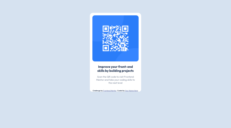
Design comparison
Solution retrospective
Any feedback will be appreciated. :)
Community feedback
- @manishdevelopsPosted over 2 years ago
hey Aseem.! happy for you for completion of this project. Let me tell you something so that you can improve your solution.
Always use <h1> first and adjust the font-size. You have used <h2> and there is no <h1> before it. that is not good practice. Also if there is no requirement of heading for a project then you have to use <h1> and set it to 0 font-size Otherwise it will show you html issue.
Marked as helpful0 - @MelvinAguilarPosted over 2 years ago
Hi there 👋. Good job on completing the challenge ! I have some feedback for you if you want to improve your code.
HTML:
- You must use a level-one heading (h1) even though this is not a full-page challenge. You can create an '<h1>' element within your 'main' element that will be hidden visually but visible and readable by screen readers. The class "sr-only" hides content visually and here are the styles to copy. e.g.:
<h1 class="sr-only">QR Card Component</h1>
- The
altattribute should explain the purpose of the image. Uppon scanning the QR code, the user will be redirected to the frontendmentor.io website, so a betteraltattribute would beQR code to frontendmentor.io
If you want to learn more about the
altattribute, you can read this article.CSS:
- Instead of using pixels in font-size, use relative units like
emorrem. The font-size in absolute units like pixels does not scale with the user's browser settings. This can cause accessibility issues for users who have set their browser to use a larger font size. You can read more about this here.
- To center the component in the page, you should use Flexbox or Grid layout. You can read more about centering in CSS here. You can read more about centering in CSS here.
I hope you find it useful! 😄 Above all, the solution you submitted is great!
Happy coding and Happy New Year! 🎉🎊🎁
1 - You must use a level-one heading (h1) even though this is not a full-page challenge. You can create an '<h1>' element within your 'main' element that will be hidden visually but visible and readable by screen readers. The class "sr-only" hides content visually and here are the styles to copy. e.g.:
Please log in to post a comment
Log in with GitHubJoin our Discord community
Join thousands of Frontend Mentor community members taking the challenges, sharing resources, helping each other, and chatting about all things front-end!
Join our Discord
