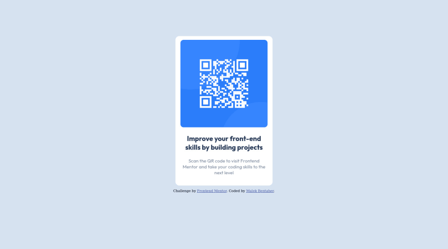
Design comparison
SolutionDesign
Community feedback
- @MelvinAguilarPosted about 2 years ago
Hi @malek-bt 👋, good job completing this challenge, and welcome to the Frontend Mentor Community! 🎉
I have some suggestions you might consider to improve your code:
- Use the
<main>tag to wrap all the main content in your solution instead of using<div class="container">.
- Use
<footer>instead of<div class="attribution">. The<footer>element contains authorship information.
- Once you update the container
<div class="attribution">, the footer should be outside the main content.
- The alternative text must not contain hyphens, underscores, or the words "image" or "photo", it must be human readable.
- To make alternative texts more worthwhile, add descriptive text to the alt attribute of the QR image to explain what the QR image does. Upon scanning the QR code, you will be redirected to the frontendmentor.io website, so an example of alternative text would be "QR code to frontendmentor.io". You can read more about alternative text here.
- Instead of using pixels in font size, use relative units of measure like
remorem. The font size in absolute length units (px) does not allow users with limited vision to change the text size in some browsers. Reference.
- In this solution it seems that you have used the bootstrap classes but you have not imported the library, that is to say, there are some leftover classes.
- One suggestion is you can decrease the number of div elements you use a bit with the following code structure:
<body>
   <main class="container">
      <img />
      <h1> . . . </h1>
      <p> . . . </p>
   </main>
   <footer class="attribution">
      <p> Challenge by ... </p>
   </footer>
<body>
I hope those tips will help you! 👍
Good job, and happy coding! 😁
Marked as helpful1 - Use the
- @AdrianoEscarabotePosted about 2 years ago
Hi Bentaher malek, how are you?
Welcome to the front-end mentor community!
I really liked the result of your project, but I have some tips that I think you will enjoy:
- every Html document must contain the main tag, so we can identify the main content, to fix this, wrap all the content with the main tag. HTML5 landmark elements are used to improve navigation experience on your site for users of assistive technology.
- As you know this project is based only on one page component, so no h1 is needed! because we don't know if this page will have a more important component, but it's always good to prevent accessibility errors so I think it would be good for you to add an
h1in this component, besides being a good practice for when you are developing larger sites, don't worry forget abouth1.
The rest is great!
I hope it helps... 👍
Marked as helpful0
Please log in to post a comment
Log in with GitHubJoin our Discord community
Join thousands of Frontend Mentor community members taking the challenges, sharing resources, helping each other, and chatting about all things front-end!
Join our Discord
