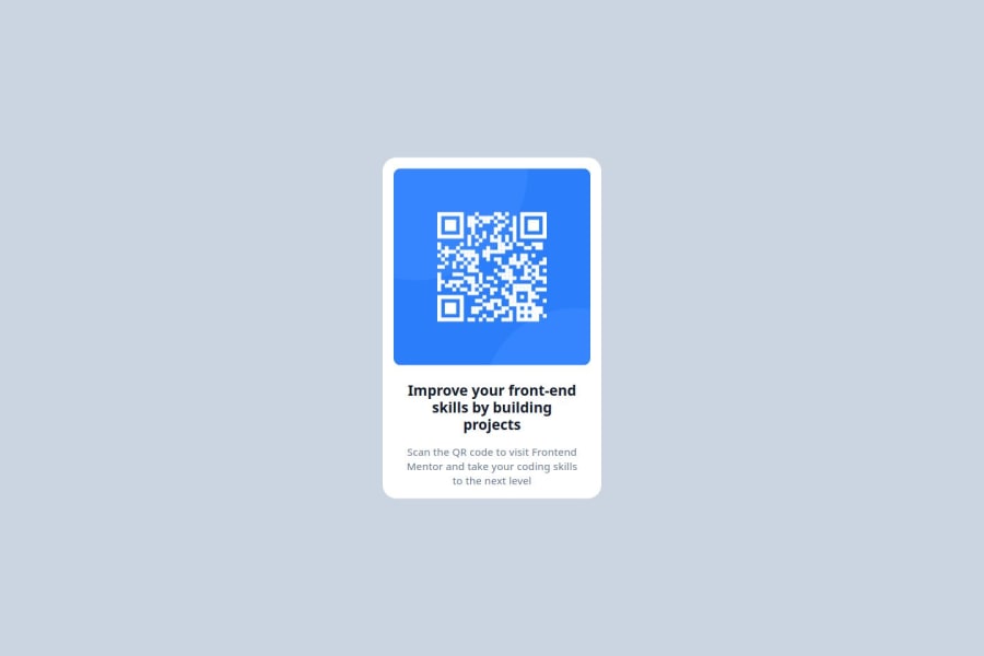
Design comparison
Solution retrospective
I just went for html + tailwind, I think I will change to a css file if Im required, if not Tailwind all the way
What challenges did you encounter, and how did you overcome them?I just learn how to center a component, I was not aware of origin points being the upper corner of a div or any html element
What specific areas of your project would you like help with?I dont know if what I did is the best thing to center a component
Community feedback
- @thomasweitzelPosted 4 months ago
You've done a commendable job with this project! The code structure is clean, and you’ve used semantic elements effectively.
- The content is aligned with Frontend Mentor’s typical project design specifications: consistent spacing, centered alignment, and readable text sizes.
- You've added a favicon (even though it's the Frontend Mentor one), which is often overlooked—nice detail.
- The use of Tailwind CSS is efficient, making the code easy to maintain.
You have added the #react hashtag to your submission, and I wonder why? It's not a React application.
Great work overall - keep building!
0
Please log in to post a comment
Log in with GitHubJoin our Discord community
Join thousands of Frontend Mentor community members taking the challenges, sharing resources, helping each other, and chatting about all things front-end!
Join our Discord
