Design comparison
Community feedback
- @Hayle-HBPosted 3 months ago
Semantic HTML: The solution uses semantic HTML elements well, such as <header>, <main>, and <footer>, which helps with both SEO and accessibility. However, consider using more specific elements like <article> or <section> where applicable to further improve the document structure.
Accessibility: The solution does a decent job with accessibility. It's important to ensure all images have descriptive alt attributes, form elements are correctly labeled, and ARIA roles are used where necessary to enhance screen reader compatibility. Adding keyboard navigability and checking color contrast ratios would further improve accessibility.
Responsive Design: The layout adapts well across different screen sizes, maintaining a good visual hierarchy and readability. However, consider testing on more devices to ensure consistent performance, especially on very small screens or older devices.
Code Quality: The code is generally well-structured and readable, with clear class names and organized styles. To enhance reusability, consider breaking down repetitive components into reusable functions or components, particularly if you’re using a framework like React.
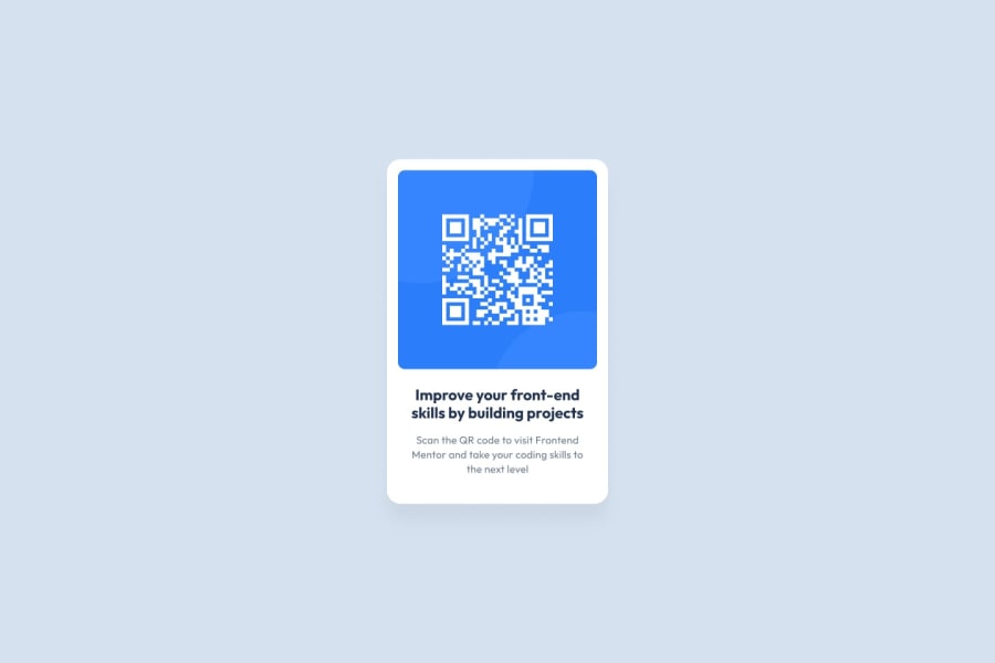
Design Consistency: The solution closely follows the design provided, but there are a few differences, such as slight variations in padding, font sizes, or color usage. Aligning these with the design spec will ensure a more polished and consistent final product.
0
Please log in to post a comment
Log in with GitHubJoin our Discord community
Join thousands of Frontend Mentor community members taking the challenges, sharing resources, helping each other, and chatting about all things front-end!
Join our Discord
