

Design comparison

Solution retrospective
I thought I was not ready for this and that many things to learn before I did anything without a teacher helping me but I did it quickly and with easy.
What challenges did you encounter, and how did you overcome them?Surprisingly, I forgot how to upload my project on Github Pages... then I just looked for tutorials for it.
What specific areas of your project would you like help with?I'm not sure if my code is semantically correct. I hope to improve it soon.
Community feedback
- @AjibosePosted 2 months ago
it is generally good, but you can try to use media queries for responsiveness on various screen size
Marked as helpful0@RaissaNvPosted 2 months ago@Ajibose I usually enjoy making media queries but this project just looked like it didn't need any. I do plan on making them for the next ones, though. Thank you for your feedback.
0 - @islem213Posted 2 months ago
Excellent overall work!
- Good use of
<main>and<section> - Alt text is present.
- Responsive Design.
- Clear structure and reusable CSS.
- Matches the design well.
Marked as helpful0 - Good use of
- @lowkkidPosted 2 months ago
inaccuracies in design:
- card backgorund should be white
- please open figma and check precise paddings and margins, in your code there is wrong spacing between text blocks and left and right padding inside card is wrong too
in general i think semantics is ok, maybe class name could be more meaningful
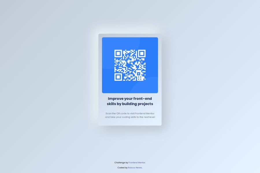
0@RaissaNvPosted 2 months ago@lowkkid Because it's my first project where I feel like I was not doing only for the classes, I wanted to add something I like so i used neumorphism in the card. Also, I can't figure how to use figma.
0


Please log in to post a comment
Log in with GitHubJoin our Discord community
Join thousands of Frontend Mentor community members taking the challenges, sharing resources, helping each other, and chatting about all things front-end!
Join our Discord