Not Found
Not Found
Not Found
Not Found
Not Found
Not Found
Not Found
Not Found
Not Found
Not Found
Not Found
Not Found
Not Found
Not Found
Not Found
Not Found
Not Found
Not Found
Not Found
Not Found

Submitted

Qr code component hub HTML, CSS and Bootstrap learning

@Devalito67

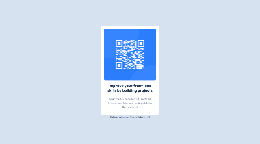
Desktop design screenshot for the QR code component coding challenge

This is a solution for...

  • HTML
  • CSS
1newbie
View challenge

Design comparison


SolutionDesign

Solution retrospective


Can someone explain me what to do with layout device info, please?

Community feedback

Adriano 34,090

@AdrianoEscarabote

Posted

Hello Devalito67, how are you? Welcome to the community of front-end mentors! I truly loved your project's outcome, however I have some advice that I hope you'll find useful:

A document ought to have one primary landmark, and the absence of a main tag around the page's primary content is the root of this issue. On this page, there is no other element that is more important than the one that this challenge is based on, so to solve it, wrap all the content in the'main' tag.

It's always a good idea to pay close attention to the proper use of semantic html elements because they are crucial for screen reader users to understand what the main content of the page is in the case of the'main' tag!

Consider using rem for font size .If your web content font sizes are set in absolute units, such as pixels, the user will not be able to re-size the text or control the font size based on their needs. Relative units “stretch” according to the screen size and/or user’s preferred font size, and work on a large range of devices.

if you want to continue coding with px, you can download a very useful extension in vscode, it converts px to rem! link -> px to rem

The remainder is excellent.

I hope it's useful. 👍

0

@Devalito67

Posted

@AdrianoEscarabote thanks for the feedback, i try to do my best so i'm glad to see you loved my project's outcome. For semantic I'm gonna change it and do it for futur project. I have download px to rem ;)

1
Adriano 34,090

@AdrianoEscarabote

Posted

@Devalito67 happy coding!!

1
coderwww 220

@coderwww

Posted

In this challenge design is essentially the same for screens width 375px and 1440 px In later challenges layout could be quite different for different width screens. and ussualy this is adressed with css media queries and mobile-first approach Also this desing has a light shadow, you can add it with css box-shadow

0

@Devalito67

Posted

@coderwww thanks for the feedback and for your help. ;)

0

Please log in to post a comment

Log in with GitHub
Discord logo

Join our Discord community

Join thousands of Frontend Mentor community members taking the challenges, sharing resources, helping each other, and chatting about all things front-end!

Join our Discord