Not Found
Not Found
Not Found
Not Found
Not Found
Not Found
Not Found
Not Found
Not Found
Not Found
Not Found
Not Found
Not Found
Not Found
Not Found
Not Found
Not Found
Not Found
Not Found
Not Found

Submitted

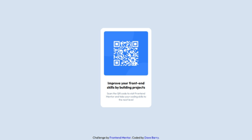
QR Code Component - HTML/CSS

IsASecret 40

@IsASecret

Desktop design screenshot for the QR code component coding challenge

This is a solution for...

  • HTML
  • CSS
1newbie
View challenge

Design comparison


SolutionDesign

Solution retrospective


What are you most proud of, and what would you do differently next time?

This was my first attempt at designing something in CSS based off some guidelines outside of FreeCodeCamp. I'm pretty happy with my design matching the guidelines, but if I was to spend more time on this, I'd make it more responsive, perhaps scale up the size of the component for larger screens more.

What challenges did you encounter, and how did you overcome them?

I'm pretty much a novice, so if there was challenge, I'd say it was deciding which method to use to center the elements (Position, Flexbox, etc). In the end Flexbox seemed the easiest method (for me), but it's really hard as a beginner to not feel like there was a better way to do this. For now though I'm trying to focus on task completion rather than 40 minutes agonizing about whether what I'm doing is best practice or not.

What specific areas of your project would you like help with?

I need some help with @media queries, and also advice on the best way to debug/verify they are working as intended. I was simply resizing the window to simulate 'smaller' devices, but I suspect Firefox Dev edition already has tools in there to do this in a better way. I was also unsure of what screen sizes to target.

Community feedback

@R3ygoski

Posted

Hello @IsASecret, congratulations on completing your first project here on Frontend Mentor, it turned out very well and very close to the proposed design.

I'd like to start by talking about the centralization part. The best way is always two, Flexbox or Grid. I'll show you both shortly so you can see how they work, but before that, I'd like to give you a tip. When centering a component, it's easier to do it through the body because your body had height: 100vh, so centering using it was easier than having to use main.

Before using the following properties, I suggest removing all margin from .container.

  • Grid:
body {
    display: grid;
    place-items: center;
}
  • Flex
body {
    display: flex;
    justify-content: center;
    align-items: center;
}

Both will work perfectly if used on the body.

Regarding using a devTools, yes, it's possible. To do this, simply press CTRL + I, or right-click anywhere on the page and click Inspect. Then, find the image of some displays (cell phone and tablet) and click there. Then you can adjust the screen size. I'm talking about all of this based on Edge, I don't know how it is on Mozilla, but it's worth trying this way.

About the @media queries, I strongly recommend that you use only min-width and start by making projects in Mobile-first Workflow, and later increase them for Desktop. And note: this snippet (max-width: 800px) is not necessary, you could reduce this (min-width: 801px) to 800px and it would work perfectly. But besides that, it seems that this whole @media screen and (min-width: 801px) is redundant because it doesn't change anything in the effects, because the container was already set to 290px.

Edit: Some links to help you:

Once again, congratulations. If you have any questions, please ask below and I'll be happy to answer and try to help in the best way possible. I'm not sure if my explanations were clear enough.

Marked as helpful

1
dewyrag 210

@dewyrag

Posted

nice job

1

Please log in to post a comment

Log in with GitHub
Discord logo

Join our Discord community

Join thousands of Frontend Mentor community members taking the challenges, sharing resources, helping each other, and chatting about all things front-end!

Join our Discord