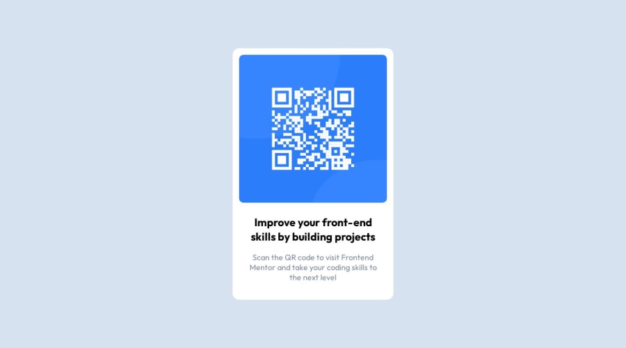
Design comparison
SolutionDesign
Solution retrospective
Is this a good way to make this deisgn?
Community feedback
- @Mennatallah-HishamPosted about 1 year ago
Hi Alberto,
You have done a good work! 😁
Some little tips to improve your code:
- use semantic html <main> for your .container and <article> for the card
- add meta description for better SEO check::https://moz.com/learn/seo/meta-description
Hope this helps 😉 and Happy coding!
1 - @mikaeljanPosted about 1 year ago
Hey!
Great job!
Few things are missing but otherwise you are on a good track.
- You are missing a box-shadow on the component.
- Check the dimensions of the image and the container, yours is a bit larger than design
- While it works in this case I am not sure the choice for grid display is the most appropriate choice. There is only one column and you are using flexbox in nested text container anyway. But this is only a minor nitpick.
1@AlbertoDeMariaPosted about 1 year ago@mikaeljan so do you think it's better to center the card with flexbox right ? thank you for this tips! I will for sure use it in my next project.
0
Please log in to post a comment
Log in with GitHubJoin our Discord community
Join thousands of Frontend Mentor community members taking the challenges, sharing resources, helping each other, and chatting about all things front-end!
Join our Discord
