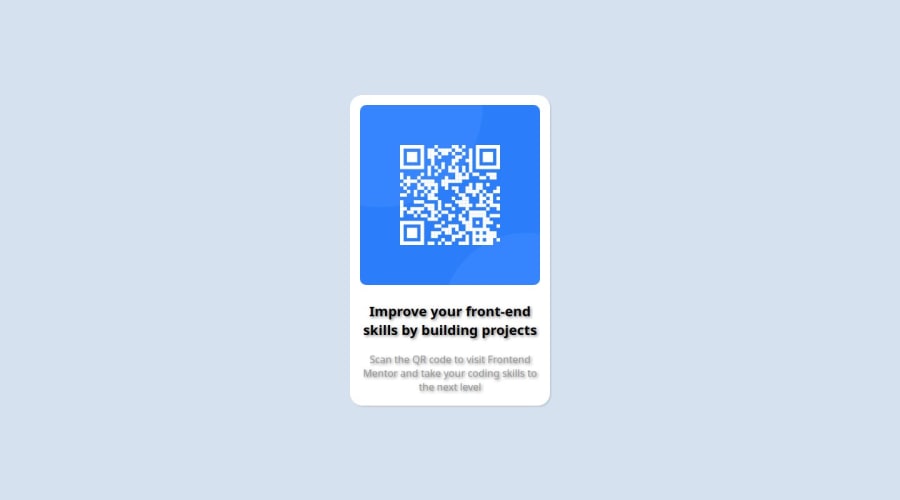
Design comparison
Solution retrospective
I was able to complete this challenge using much less time than I did in my first challenge.
What challenges did you encounter, and how did you overcome them?I could not style the shadow properly and I still need more refinement on using margins and paddings
What specific areas of your project would you like help with?I need help with paddings and margins. Any other tips on increasing my speed with challenges as well as improvements in the readability of my css
Community feedback
- @ChantalNgwenyaPosted 2 months ago
Here’s some feedback on the solution, focusing on HTML semantics, accessibility, layout, and code structure:
1. Semantic HTML:
- Strengths: The use of the
<main>element is good because it helps establish the primary content of the page. - Opportunities for improvement:
- The
<header>and<footer>tags are included but empty. If there’s no content in these sections, you can either remove them or add content to make the structure complete. - It’s important to use semantic tags like
<section>or<article>for the distinct content inside the<main>instead of relying only on<div>elements. For example, the heading and paragraph could be grouped inside an<article>or<section>for better semantic meaning. - The
alttext for the image is a bit vague. A more descriptive alt text such as"QR code linking to Frontend Mentor website"would provide more context for users with screen readers.
- The
Suggestion:
<article class="card">
  <div class="image-container">
    <img class="image" src="./images/image-qr-code.png" height="288" alt="QR code linking to Frontend Mentor website">
  </div>
  <section class="text">
    <h1>Improve your front-end skills by building projects</h1>
    <p>Scan the QR code to visit Frontend Mentor and take your coding skills to the next level.</p>
  </section>
</article>
2. Accessibility:
- Strengths: The page is simple and clean, which is good for accessibility.
- Opportunities for improvement:
- Ensure there is a clear focus state for interactive elements like links (if any) to make it easier for keyboard users to navigate.
- There’s no
<meta>description, which is important for search engines and screen readers. Add a description to give more context about the page’s content.
Suggestion:
<meta name="description" content="Scan the QR code to visit Frontend Mentor and take your coding skills to the next level.">3. Layout and Responsiveness:
- Strengths: The layout appears to be simple and structured, and the image uses a fixed height which works well.
- Opportunities for improvement:
- Ensure the layout works well on smaller screen sizes by testing it with different device widths. Make sure the text and image scale appropriately, and add media queries if necessary.
- Instead of hardcoding the image’s height, you might want to make it more responsive by using percentages or max-width. This will allow the image to resize better on different devices.
Suggestion:
.image {
  max-width: 100%;
  height: auto;
}
4. Code Structure and Reusability:
- Strengths: The code is fairly well-structured and simple, which is great for readability.
- Opportunities for improvement:
- Consolidate redundant
<div>elements. For instance, the separateheadingandparagraphdivs inside thetextdiv aren’t necessary, and the structure can be simplified. - Consider using CSS classes that reflect the content more descriptively. For instance, naming the
cardsomething more specific likeqr-cardwould make the purpose of the class clearer.
- Consolidate redundant
Suggestion:
<section class="qr-card">
  <!-- No need for extra divs -->
  <img src="./images/image-qr-code.png" alt="QR code linking to Frontend Mentor website">
  <h1>Improve your front-end skills by building projects</h1>
  <p>Scan the QR code to visit Frontend Mentor and take your coding skills to the next level.</p>
</section>
5. Consistency with the Design:
- Ensure that the design follows the challenge’s specifications, including:
- Font sizes and colors
- Padding, margin, and spacing between elements
- Alignment and positioning of text and images
- Responsive behavior on mobile devices
Test the layout with tools like Chrome DevTools to see how it behaves across different screen sizes.
Overall Recommendations:
- Improve semantic structure by using
<section>,<article>, and removing unnecessary<div>elements. - Focus on accessibility with proper alt text, meta descriptions, and interactive element focus states.
- Test the responsiveness of the layout on various screen sizes and ensure it’s flexible with CSS percentages or relative units like
emorrem. - Simplify the code for better readability and maintainability.
With these tweaks, the project will be more robust, accessible, and aligned with best practices for web development!
Marked as helpful1 - Strengths: The use of the
Please log in to post a comment
Log in with GitHubJoin our Discord community
Join thousands of Frontend Mentor community members taking the challenges, sharing resources, helping each other, and chatting about all things front-end!
Join our Discord
