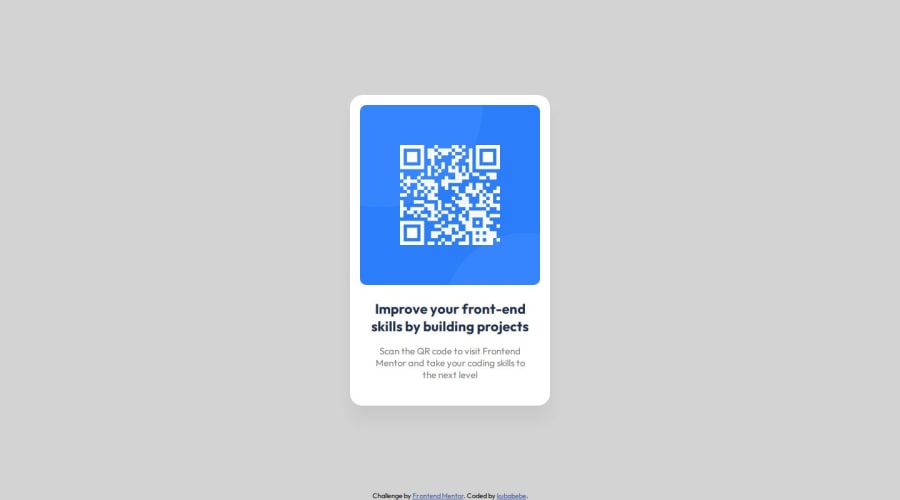
Design comparison
SolutionDesign
Solution retrospective
What are you most proud of, and what would you do differently next time?
This is my third attempt at the challenge. I hope it will be good this time.
What challenges did you encounter, and how did you overcome them?Centering elements in flexbox. Adding this elements helped
    html {height: 100%;}
    body {height: 100vh; marign: 0px;}
Check if the solution is valid and conforms to best practices and standards.
Community feedback
- @theerapat014Posted 6 months ago
background color you wrong
0@kubabebePosted 6 months ago@theerapat014 I don't know why. On my two monitors it looks good, but after added it to repo it's look like gray-brown. Check my repo its lightgray aka. #D5E1EF. Try run it locally :D
0
Please log in to post a comment
Log in with GitHubJoin our Discord community
Join thousands of Frontend Mentor community members taking the challenges, sharing resources, helping each other, and chatting about all things front-end!
Join our Discord
