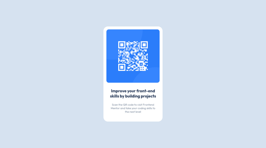
Design comparison
SolutionDesign
Solution retrospective
I found it difficult to get my padding correct for the text. Also, I attempted MQ for tablet and desktop. I feel like I made it harder or more complicated then it needed to be.
I tried to keep accessibility in mind. Please tell me what I could do better, or any best practices I missed.
Community feedback
Please log in to post a comment
Log in with GitHubJoin our Discord community
Join thousands of Frontend Mentor community members taking the challenges, sharing resources, helping each other, and chatting about all things front-end!
Join our Discord
