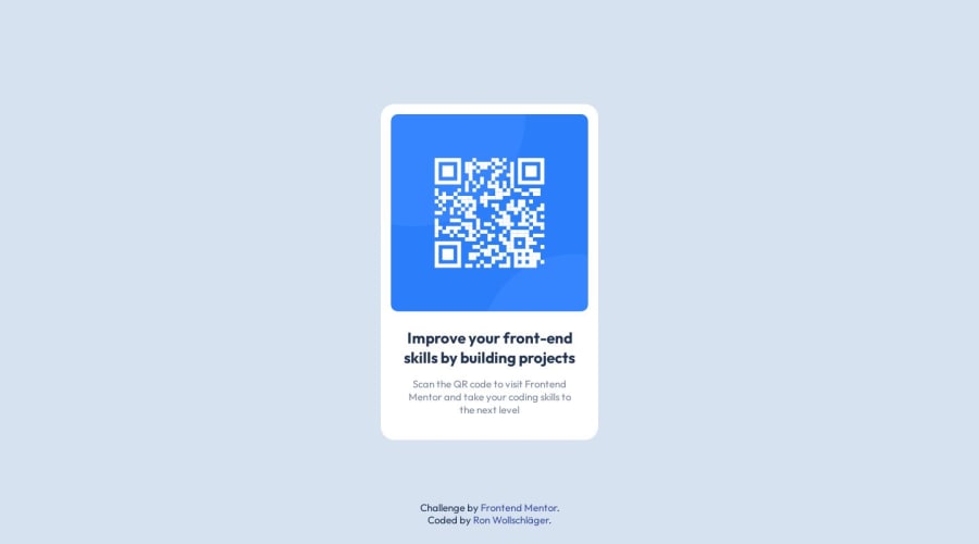
Not Found
Not Found
Your session has expired please log in again.
Not Found
Not Found
Not Found
Not Found
Not Found
Not Found
Not Found
Not Found
Not Found
Not Found
Not Found
Not Found
Not Found
Not Found
Not Found
Not Found

Submitted

QR code component / HTML & CSS

@ron-wollschlaeger

Desktop design screenshot for the QR code component coding challenge

This is a solution for...

  • HTML
  • CSS
1newbie
View challenge

Design comparison


SolutionDesign

Solution retrospective


Hi there! :) Thanks for your time! I really appreciate it.

What did you find difficult while building the project?

This is now my second challenge I have done on this page, and I am very happy so far. This challenge felt easy and finished quickly. It felt nice to build it, but I am thinking a lot of my code of how readable it is or if some tags are unnecessary or not.

Which areas of your code are you unsure of?

Three things are a big concern for me at this challenge:

  1. How to know which unit should be used? I am unsure about when to use px, % or go to vh, vw, em and so on.
  2. How and when to comment the right way? At my first challenge, I commented almost everything. This time only the Main elements. Is there a plan on how to do it right?
  3. I am using <main> and <section> tag just because I know there should be at least one main tag in a page but for this challenge it felt like I don't need the main or section tag, but I did it because I wasn't sure about it.

Thanks in advance for your Feedback and your time you invest to read this! I wish you a wonderful day.

Community feedback

Lucas 👾 104,420

@correlucas

Posted

👾Hello Ron, Congratulations on completing this challenge!

I’ve few suggestions to you that you can consider to add to your code:

1.Use relative units as rem or em instead of px to improve your performance by resizing fonts between different screens and devices. These units are better to make your website more accessible. REM does not just apply to font size, but to all sizes as well.

2.Add a margin of around margin: 20px to avoid the card touching the screen edges while it scales down.

3.To maintain the card responsive use max-width instead of width this way you allow the content to be flexible. The difference between max-width and width is that width is fixed and max-width have a maximum size but can shrink to fit the content.

4.Your html code is not optimized yet, since its too long and have some unnecessary elements. To make it clean you start by removing some unnecessary <div>. For this solution you wrap everything inside a single block of content using <div> or <main> (better option for accessibility) and put inside the whole content <img> / <h1> and <p>.

<body>
<main>
<img src="./images/image-qr-code.png" alt="Qr Code Image" >
 <h1>Improve your front-end skills by building projects</h1>
<p>Scan the QR code to visit Frontend Mentor and take your coding skills to the next level</p>
</main>
</body>

✌️ I hope this helps you and happy coding!

Marked as helpful

1

@ron-wollschlaeger

Posted

@correlucas Thanks a lot for your quick response. It feels like you are just waiting behind the corner for people to help. Thanks a lot.

  1. Do you use em rem for everything or just for fonts? When do you use px? Only for things like margin or paddings? And how about the other units?

  2. That's a good idea. I will do this for my next challenge.

  3. Good explanation, I will keep that in mind.

  4. Ok, so I overcomplicated things again. When do you think it makes sense to wrap something in a div?

Last thing from me: What do you think about my question about commenting?

Thank you

0
Lucas 👾 104,420

@correlucas

Posted

@pxMahio I often code my whole solution using px and the convert in the end to rem. I select all my code and then use a plugin in VSCODE to convert, https://marketplace.visualstudio.com/items?itemName=sainoba.px-to-rem to do the automatic conversion or use this website https://pixelsconverter.com/px-to-rem

I don't use much other units, few times I use percentage, but when I need to divide some elements in equal parts I prefer to build it with GRID

You can use divs when by force you need a group of elements with a different alignment or position for the other elements, for example using flexbox with flex-direction: column. In the next challenges you'll situations like that.

About commenting a think is an amazing idea, in special when you have a huge amount of sections this way you can separate the code visually with the comments

Marked as helpful

1

@ron-wollschlaeger

Posted

@correlucas This px - rem plugin is awesome! I will give it a try on my next challenge. Thanks for your input! :)

1

Please log in to post a comment

Log in with GitHub
Discord logo

Join our Discord community

Join thousands of Frontend Mentor community members taking the challenges, sharing resources, helping each other, and chatting about all things front-end!

Join our Discord