Design comparison
SolutionDesign
Solution retrospective
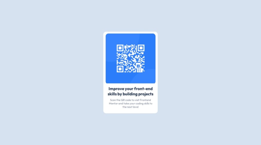
This is my first challenge submission. I'm unsure if the way I used widths is correct or if there is a better way. Any feedback is appreciated.
Community feedback
- @FreedteckPosted about 1 year ago
Hey! I checked your code and everything is fine, Just a little change.
Ur qr-image should have the max-width of 100% for it to fit desired container instead of fixed width.
Also, I suggest you use padding in the container instead of specified height. All should be good from there
Marked as helpful0
Please log in to post a comment
Log in with GitHubJoin our Discord community
Join thousands of Frontend Mentor community members taking the challenges, sharing resources, helping each other, and chatting about all things front-end!
Join our Discord
