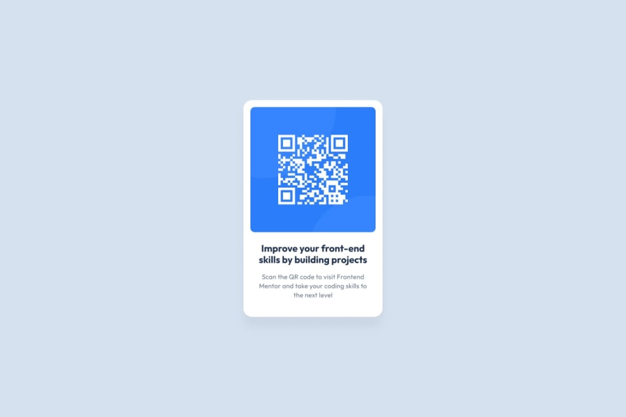
Design comparison
Solution retrospective
Any advice to better distribute the elements and avoid overflow is appreciated, any feedback is welcome, thanks :)
Community feedback
- @PhoenixDev22Posted over 2 years ago
Hi Alejandro,
Congratulation on completing this frontend mentor challenge. Excellent work! I have some suggestions regarding your solution:
- In my opinion, the alternate text is needed on this image. The alternate text should indicate where the Qr code navigate the user : like
QR code to frontend mentornot describes the image.
- Adding
rel="noopener"orrel="noreferrer"totarget="_blank"links. When you link to a page on another site usingtarget=”_blank”attribute , you can expose your site to performance and security issues.
Overall, your solution looks good. Hopefully this feedback helps.
Marked as helpful1 - In my opinion, the alternate text is needed on this image. The alternate text should indicate where the Qr code navigate the user : like
- @correlucasPosted over 2 years ago
👾Hello Alejandro, congratulations for your new solution!
Your solution is really complete, but you've add some divs that are not really necessary. Try the steps below to have a cleaner code.
You can build this with a simple approach, without using unnecessary divs, all you need is a single
<main>or<div>to keep all the content inside, and nothing more. The ideal structure is thedivand only the image, heading and paragraph.See the structure below:
<body>
<main>
<img>
<h1></h1>
<p></p>
</main>
</body>
👋 I hope this helps you and happy coding!
Marked as helpful1
Please log in to post a comment
Log in with GitHubJoin our Discord community
Join thousands of Frontend Mentor community members taking the challenges, sharing resources, helping each other, and chatting about all things front-end!
Join our Discord
