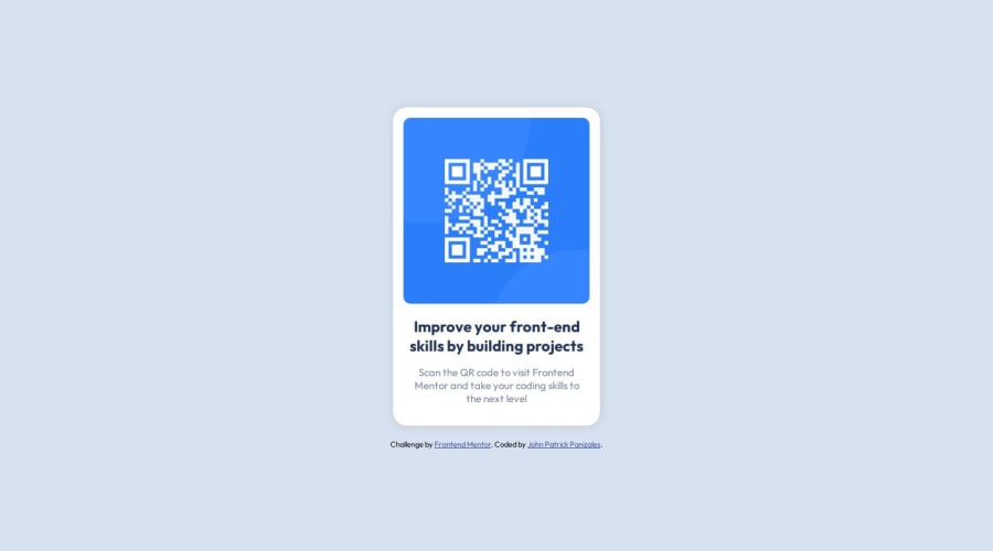
Design comparison
Solution retrospective
I'm just happy I know what concepts to look up for while building the project. I hope that next time I'll be comfortable with the basics without having to look them up.
What challenges did you encounter, and how did you overcome them?I had struggled a bit with styling, especially since I'm still trying to figure out things like how flexbox works, how are styles inherited by child elements. Basically, I still have a lot to polish when it comes to my understanding of how CSS implements things.
What specific areas of your project would you like help with?Any feedback on my HTML structure and my approach in organizing my CSS is appreciated.
Community feedback
- @e-liaszPosted 11 months ago
The design is pretty much spot on, I think that is a huge strength. The code is clear and readable to me, and I think it would be easy to reuse it for similar projects as well. I wish I could offer more feedback but as I am still a beginner, I'm also learning similar things along the way - but I think you've got a great foundation for the future here.
0 - @ysstudio22Posted 11 months ago
Hi there. I think .main-card could be slightly taller by adding some padding on the top and bottom of the text.
0
Please log in to post a comment
Log in with GitHubJoin our Discord community
Join thousands of Frontend Mentor community members taking the challenges, sharing resources, helping each other, and chatting about all things front-end!
Join our Discord
